I have calculated Normalized difference vegetation indices from landsat 5 band 3 and band 4 that have 0-0.38 minimum and maximum ranges respectively. But whenever I open the same NDVI.tiff file in ArcGIS 10.1, it shows me the 0-0.68 valid ranges. Is there any different interpolation techniques of showing the same file in different software?
-
1Have you calculated statistics in ArcGIS? If you navigate to the raster in ArcCatalog, right click on it ans select calculate statistics.– Jeffrey EvansCommented Oct 23, 2014 at 18:36
-
@Jeffrey Evans. Yes I did it now, value ranges are -0.079-0.57, that is still different from the ranges had appeared in qgis.– Waseem AliCommented Oct 23, 2014 at 18:50
-
1Where did you see the ranges in QGIS? Just visually or in the metadata?– SaultDonCommented Oct 23, 2014 at 18:52
-
@SaultDon. I took these ranges just visually in QGIS not from the metadata, this was the problem actually. These ranges are same in metadata. problem resolved. should I consider these ranges limit for my analysis not that shown by visually. actually i want to make the colour map.– Waseem AliCommented Oct 24, 2014 at 4:09
-
@SaultDon. I have created another post link– Waseem AliCommented Oct 24, 2014 at 7:39
2 Answers
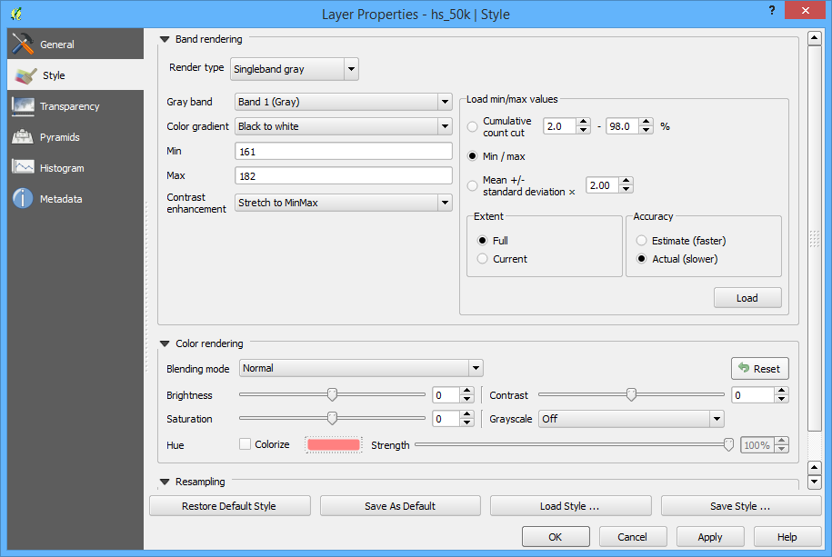
In QGIS, by default cuts the full range of values off and only shows those in the 2-98% range. No idea why this is the default, but it is.
You can change that by opening the properties window for that raster layer and going to the Style tab.
In there, change "Load min/max values" to "Min / Max" and make sure "Extent" is set to "Full", also might help to change "Accuracy" to "Actual".
Then press "Load" and then "OK" to get back to the map.

I'm curious if after making these changes in QGIS, it would match what you see in ArcGIS.
-
Min and Max ranges has already been resolved in your previous comment. Did you see my new post. NDVI dynamic ranges varies between -1.0 to +1.0. I have different ranges that varies from -0.30 to 0.50, 0.05 to 0.65, -0.07 to 0.48. How should i scale all values with the same range so that i could see the relative change between the successive images as Hu and Jia did in his paper.new_post, in which link and dataset attached. Answer the question in a precise way. Commented Oct 24, 2014 at 19:14
-
In a "singleband psuedocolor" render type, there is nice options of "generate new color map" by which I used new color ramp type of color brewer "spectral" with 6 colors. But this functionality is not seen in ArcGIS. Can I save this style for use in ArcGIS. Commented Oct 26, 2014 at 8:02
-
@WaseemAli There isn't a way to get styles from QGIS to ArcGIS as far as I know. But there is an "idea" somewhere in the ArcGIS Ideas page that requests this feature to convert SLD to .style and back and forth to increase interoperability.– SaultDonCommented Oct 26, 2014 at 18:34
Check your bit depth. ArcGIS does strange things to rasters sometimes. It may have changed the radiometric resolution of the file.
-
How can I cope with bit depth. The data type of the raster is 64 bit tif that was processed in QGIS 2.4.0. Commented Oct 25, 2014 at 12:45
