1

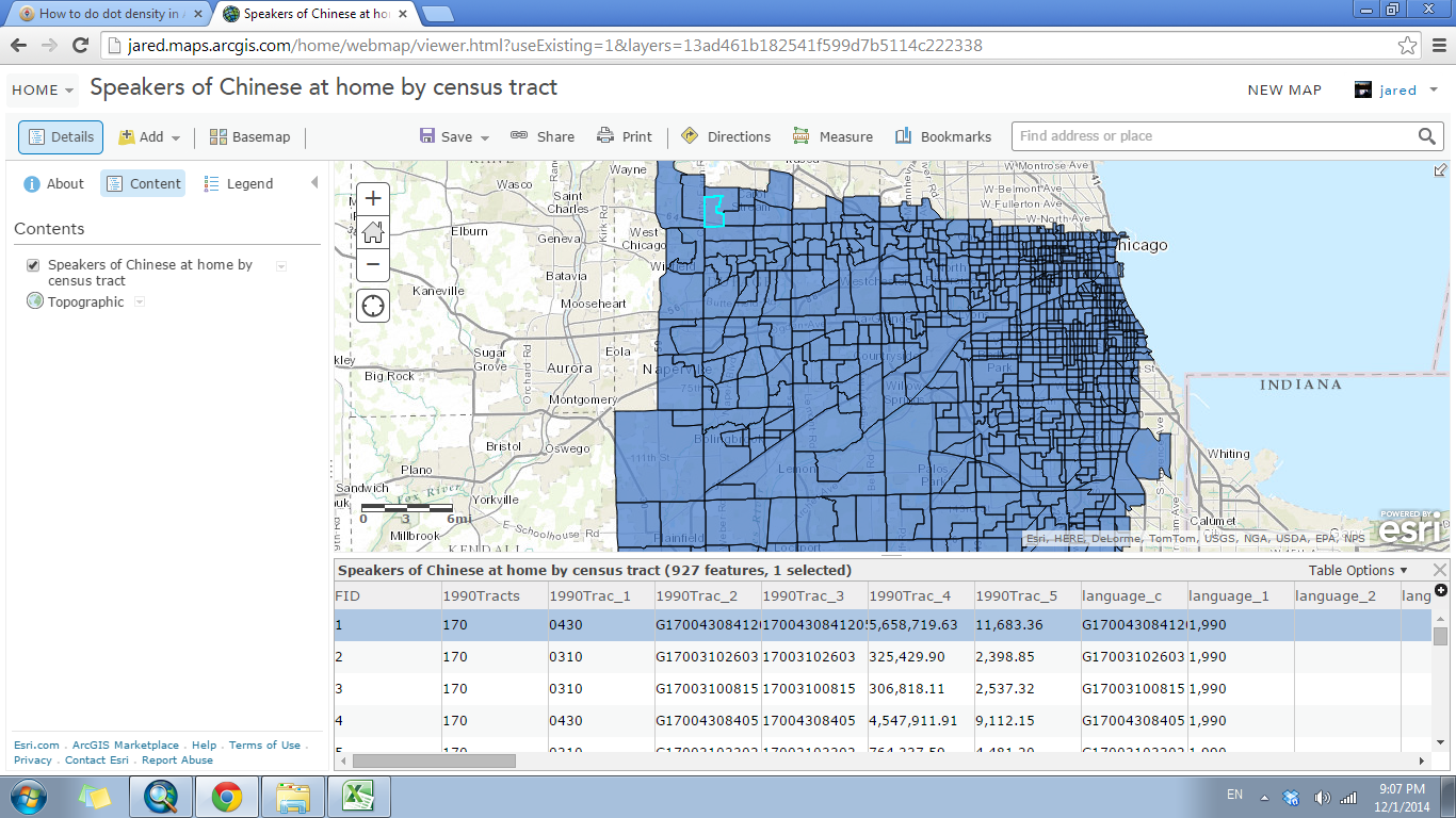
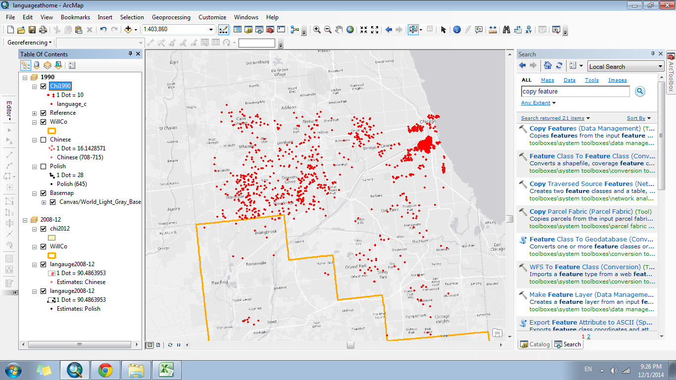
I have some census tract polygons with language spoken at home attribute data behind them. I created them in ArcMap and produced a dot density map. However, after importing to AGOL it's only the polygons. I am aiming to create a swipe map comparing two maps visualizing the growth of language outwards from the city to suburbs over 20 years.

Here's a before and after image of the tracts in ArcMap, then AGOL: enter image description here
enter image description here

1 Answer 1

1

This is possible in the ArcGIS Server JavaScript API using the Dot Density Renderer:

The DotDensityRenderer provides the ability to create dot density visualizations on data. A dot density map can be used to visualize the variation in spatial density of a discrete spatial phenomenon.

There is a sample available here.

(I'm not sure whether it's possible out-of-the-box in ArcGIS Online, so you may need to build something yourself using the JS API.)

Your Answer

By clicking “Post Your Answer”, you agree to our terms of service and acknowledge you have read our privacy policy.

Not the answer you're looking for? Browse other questions tagged or ask your own question.