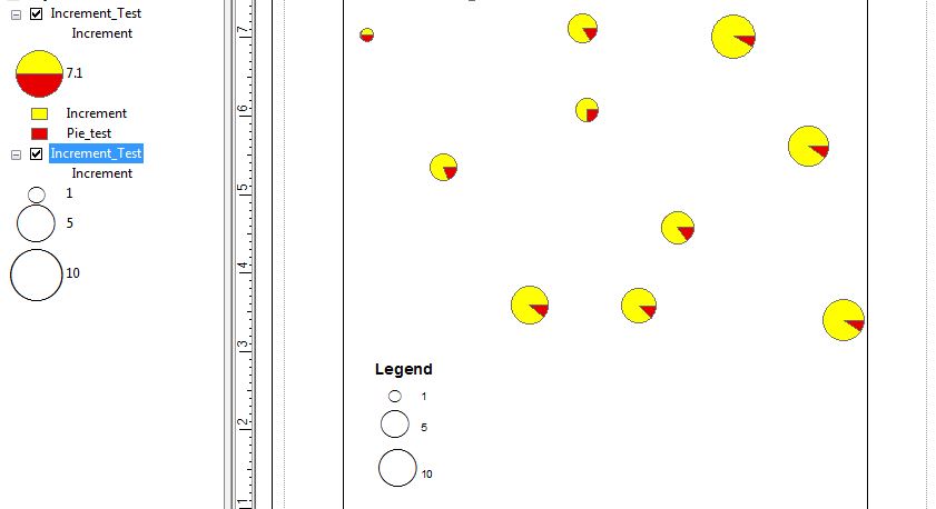
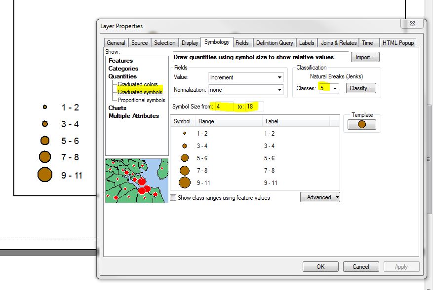
Per the additional info provided by the OP, one way to achieve a range of sizes that correspond to sized pie charts in the map display is to create a copy of the sized pie chart layer and symbolize it using proportional symbols based on the same field. For example: if pie charts are sized using attribute A, then the second layer (ordered beneath the pie chart layer) would be symbolized using proportional symbols also based on A. The next step (somewhat tedious, but AFAIK the only workaround for this), is to set the Min Value symbol size so that it matches your smallest pie chart. In the attached example, the pie chart layer is displayed using default settings/sizes based on attribute A, and the proportional symbol layer is displayed based on attribute A, using 3 classes (user defined #), with a Min Value symbol at 15pt. I didn't expect this to work, but for at least these 10 classes, the proportional symbols scaled almost exactly with the scaled pie charts. There may be some small size discrepancies, but if the goal is to convey a range of values of associated with relative sizes, I think this approach achieves the desired effect. Note that you can also choose any point symbol as your proportional display, so you could choose a half/half point that looked more similar to a pie chart if desired.

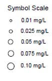 I'm using ArcGIS 10.3 and the "Legend Wizard" does not offer me a method to include symbol size within my legend. I have my symbols by color in the legend but I would like them by symbol as well, as seen in the example jpg here.
