4

I'm an R user and have been using libraries like gistools and rgdal. I notice that ArcGIS appears to have features to add pie charts onto the maps themselves. (For example, if I have a map of the US, I can add a pie chart to each state). However, a quick search of gistools and rgdal documentation does not show any function to add such features.

Is there any easy way to add pie charts onto maps in R?

2 Answers 2

5

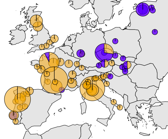
There are several options depending on which R package you want to use. The following links should give you some insights into some of the possibilities available.

Example from http://www.molecularecologist.com/2012/09/making-maps-with-r/

(Map Sourced from: http://www.molecularecologist.com/2012/09/making-maps-with-r/)

2
  • I think there's a typo on the maptools page: floating.pie() is supposed to be used with the plotrix package. Also, maptools doesn't have any functions to add pie charts, at least at the time of writing
    – wwl
    Commented Oct 20, 2016 at 14:51
  • Good answer, but add.pie is a function in mapplots rather than maptools
    – Thraupidae
    Commented Mar 25, 2019 at 21:24
1

I might add here: add.pie() is a function of mapplots.

In the documentation of "mapplots" draw.pie() is the recommended function to use

Be careful if you combine the package RgoogleMaps and "mapplots". The coordinates are scaled as soon as you set a "Zoom" parameter. Here an example of an arbitrary data frame:

map1=GetBingMap(center=c(47.619048,-122.35384),zoom=15,apiKey=apiKey, 
                  verbose=1, destfile="Seattle.png") 
PlotOnStaticMap(map1)

if you add multiple pie charts on the map, this will only give you a cluster in the middle of your plot! (Note df$values is a matrix containing at least two columns corresponding the size of a slice)

library(mapplots)
draw.pie(z=df$values, x=df$lat, y=df$long, radius = 20, col=c(alpha("orange", 0.6), alpha("blue", 0.6)), labels="")

Hence you will have to rescale your pie chart coordinates first (use the map and zoom factor as above):

xy <- LatLon2XY.centered(map1,df$lat, df$long, zoom = 15)

library(mapplots)
draw.pie(z=df$values, x=xy$newX, y=xy$newY, radius = 20, col=c(alpha("orange", 0.6), alpha("blue", 0.6)), labels="")

Your Answer

By clicking “Post Your Answer”, you agree to our terms of service and acknowledge you have read our privacy policy.

Not the answer you're looking for? Browse other questions tagged or ask your own question.