15

I'm using plotrix in R to plot a state level map of the US. It has an excellent function floating.pie to put pie charts on each state.

I'm wondering if there are similar functions within the plotrix package to display bar charts in each state? (I took a look at the documentation and the functions that deal with bar charts don't seem to have this possibility, but I just wanted to be sure.) I prefer to work within the plotrix package if possible, but feel free to name other packages.

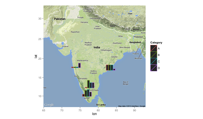
As an example, I would be interested in producing a map similar to this (but for the US):

enter image description here

For my US map, there would be 50 bar charts, one for each state.

I got this map from https://stackoverflow.com/questions/20465070/barplots-on-a-map, but it seems that ggsubplot doesn't work on my version of R (similar to what others have been saying on the post).

2
  • 2
    I also knew how to do it with ggsubplot package, but it is now deprecated and it won't work (as you mentioned). Perhaps this post can be a starting point: stackoverflow.com/questions/36063043/… Commented Dec 14, 2016 at 14:03
  • Consult the documentation on plotrix, to see if such functions exist. Then consult the creator of plotrix.
    – Mox
    Commented Mar 5, 2018 at 19:53

2 Answers 2

2

I know I'm really late with this, but I think I've found a rather simple solution.

If you have a look of the source code of floating.pie() (e.g. by calling getAnywhere(floating.pie)), you will notice that it uses a very simple yet effective approach: drawing the pie segments as polygons. If all you want from your bar charts is the bars (no labels, axes, etc.), you can follow the same approach and write your own function. Here's a quick and dirty version:

# the function 
mapbars <- function (x, xllc = 0, yllc = 0, barwidth=1, maxheight=10){
  # calculate how long each bar needs to be
  bars <- (x/max(x)) * maxheight
  # get some quick colors
  col <- rainbow(length(x))

  for(i in 1:length(x)){
    # figure out x- and y coordinates for the corners
    leftx   <- xllc + ((i-1) * barwidth)
    rightx  <- leftx + barwidth
    bottomy <- yllc
    topy    <- yllc + bars[i]
    # draw the bar
    polygon(x=c(leftx, rightx, rightx, leftx, leftx),
            y=c(bottomy, bottomy, topy, topy, bottomy),
            col=col[i])
  }
}
  • x is for the values to be represented by the bars
  • xllc and yllc specify the position of the lower left corner of the left bar in whatever coordinate system you are using
  • barwidth and maxheight are used for scaling the size of the bars

Here's a demo with a basic sp-based plot. I don't think I've worked with plotrix before, but based on how floating.pie works, I'd assume that this should also work with plotrix.

library(sp)
library(maptools) # just for easy access to a background map
# load some country borders as a background
data("wrld_simpl")
plot(wrld_simpl)

# zoom on a bit …
mexico <- subset(wrld_simpl, NAME=="Mexico")
plot(mexico, axes=TRUE)

# data for the bars
x1 <- c(4, 7, 1, 2)

# plot
plot(mexico, axes=TRUE)
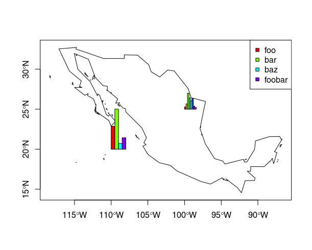
mapbars(x=x1, xllc=-110, yllc=20, barwidth=.5, maxheight=5)
legend(x="topright", pch=22, col="black", pt.bg=rainbow(x1), legend=c("foo", "bar", "baz", "foobar"))

# add another one:
x2 <- c(9, 21, 64, 45, 33, 43, 12, 7)
mapbars(x=x2, xllc=-100, yllc=25, barwidth=.2, maxheight=2)

The result looks like this: example map resulting from above code
2
  • I receive this error when I run the mapbars line > mapbars(x=x1, xllc=-110, yllc=40, barwidth=.5, maxheight=5) Error in mapbars(x = x1, xllc = -110, yllc = 40, barwidth = 0.5, maxheight = 5) : could not find function "mapbars"
    – 324
    Commented Feb 27, 2020 at 15:22
  • That sounds like you did not run the code in the first part of my answer. The function mapbars is defined in the first big block of code, where is says mapbars <- function (x, xllc = 0, .... You will have to execute that whole section of code first, to "teach" R the new command. Commented Feb 28, 2020 at 14:56
-1

ggplot2 and ggvis are two libraries which may help you to display the plots on the map. In ggplot2 you can plot bubbles on the map and then you just need to give aes() the coordinates which have nothing to do with the size and color of bubble. Regarding bar chart, you need to assign at least 2 pairs of x and y, one for bar chart location and the other for the height and width of the bar chart. In other words, you need to know the coordinates of 4 corners for a bar.

Your Answer

By clicking “Post Your Answer”, you agree to our terms of service and acknowledge you have read our privacy policy.

Not the answer you're looking for? Browse other questions tagged or ask your own question.