I'm using QGIS 1.8.
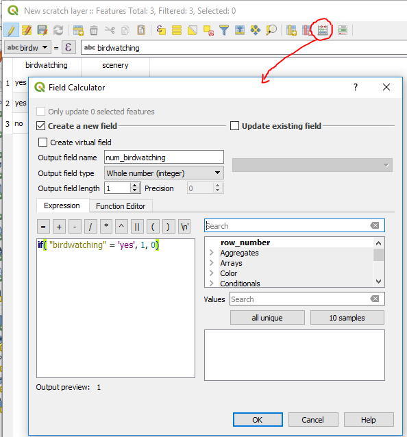
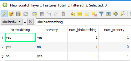
I have a csv file with a list of nature reserves and their coordinates, and there are 10 columns such as 'birdwatching', 'scenery', etc with either 'yes' or 'no' under each for every nature reserve.
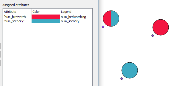
What I need to do is display all this as best I can on one map, and since most of the reserves have more than one attraction I figured the best way to do that is with the pie chart function.
When I add in all the attribute fields ('birdwatching', 'scenery' etc) all that I get is empty circles.
I've been playing aroud with settings but can't figure out how to make it work.


