1

I am trying to group around 100 points based on their frequency and occurred month (similar to https://i.sstatic.net/i7Mzi.png) but I haven't found a solution yet. Tried many tools in QGIS but till now didn't work.

How should I approach this?

Here is my dataset: https://i.sstatic.net/B3c14.png

3
  • can you show the head of the data set (first 5-10 rows) and what have you done? Besides that it is not clear to me what your goal is.
    – Elio Diaz
    Commented Nov 3, 2017 at 17:56
  • Thanks for your swift reply Elio. I have added a screenshot of the dataset to my question. My goal is to map grouped incidents based on their frequency and colour categorize them by their occurred month.
    – user108470
    Commented Nov 3, 2017 at 18:07
  • If you need also to ask about ArcGIS Desktop you can always do that in a separate question
    – PolyGeo
    Commented Nov 3, 2017 at 19:37

2 Answers 2

1

In your Congo image symbols do overlap (besides that i wouldn't suggest using a red gradient for distinguishing months, my first impresion was that darker symbols had more incidents); what you have to do first is to process your dataset, making group stats (there's a plugin GroupStats for QGIS or you may use very simple code in R), your goal is to summarize NGO_incidents by place and date, then you'll have a dataset for mapping, where you'll choose symbol size according to count and symbol color according to month

0

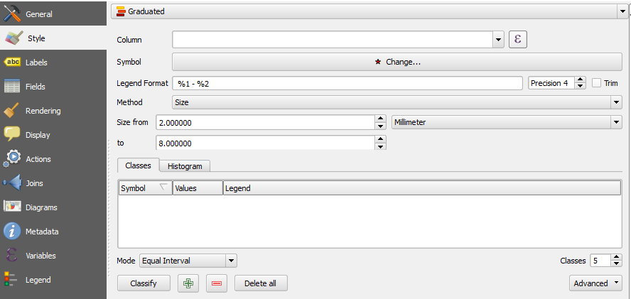
Alternatively, if you want a simple GUI-based solution in the QGIS console, you can update the symbology for your layer in the layer properties window. Under style, you can select "Style" and then "Graduated" from the drop-down, in order to symbolize your points with differing size and coloring based on NGO incident volume:
enter image description here

It might seem like you have to choose by size OR color, but you can do both if you select size (and set the range, per the image above), and finally classify your dataset. You can then preview and then change the coloring for each symbol, which should then be sized differently.

If you are then having an issue with symbols overlapping, choose "Point displacement" instead of "Graduated" - you can choose the same options for symbol representation (size and color based on a field in the data), but you can also specify offsets.

Your Answer

By clicking “Post Your Answer”, you agree to our terms of service and acknowledge you have read our privacy policy.