I have several columns of data that have percentage values. Some are positive and some are negative. In one particular column, the values range from -0.70 to +0.20. The mean value of the column is around -0.08.
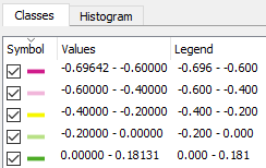
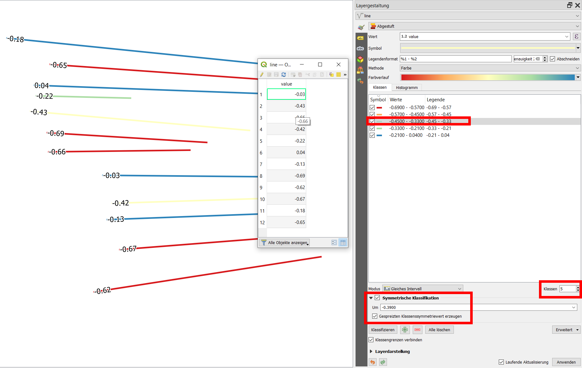
I want to color these features using a divergent color ramp (for example, the Spectral ramp). But the symbology options in QGIS seem to not give me an option where the actual color divergence happens, so I get classifications like these:
Note how the yellow color is arbitrarily centered on -0.1, not 0.
How can I force the central color of the color ramp to be centered on 0?
For example, how can I tell QGIS to do "Pretty breaks", but on a given range instead of the data column itself? Do I have to do this manually?


