6

I am trying to make a map using US census data showing vacant housing to total housing on the same map.

I came across the "multiple attributes" feature under the symbology tab and wondered if this is the way to go and, if so, how to use it?

I have only been able to get one type of symbol, the gradient feature to appear.

I'm using ArcGIS Desktop 10.

0

2 Answers 2

13

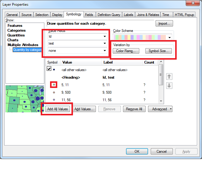
The multiple attributes feature under symbology is indeed the way to go. If you select the two categories that you want to use to colour and scale your symbols in the value fields section and then select Add All Values to create a list of all the unique combinations of value pairs. To apply the scaling by colour and symbol size click on the Color Ramp and Symbol Size buttons and select one of your two fields in each box.

Menu image

You can also manually style individual value pairs by double clicking on the symbol beside the value pair and selecting your preferred style.

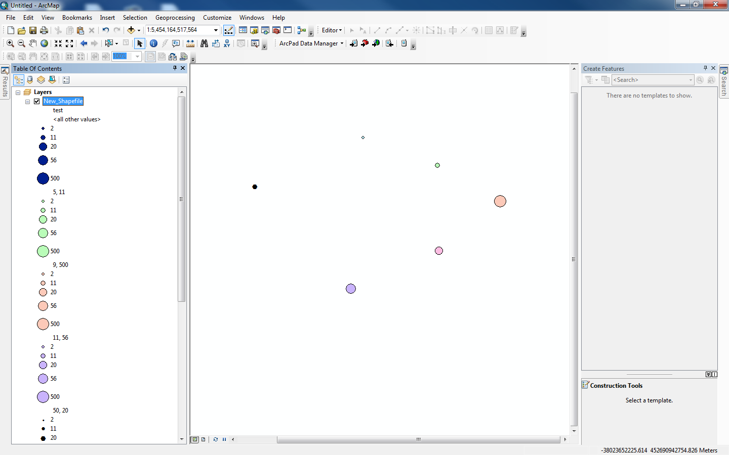
I did this for some sample data I created and got results like this:

result image

Some more help can be found in the ArcGIS documentation which covers more complex cases.

2
  • 2
    I was surprised not to be able to find a page in the Help describing ways Multiple Attributes could be used for Symbology.
    – PolyGeo
    Commented Oct 2, 2012 at 8:48
  • 1
    This answer is somewhat misleading in the first part. The Variation by option is one or the other - not both. Whichever field you pick will automatically be set in either option. It's just a question of do you want to use that field with size or color. You cannot set two different fields by different variations at the same time. That must be done manually, as you have in your second screenshot.
    – Chris W
    Commented Jul 22, 2015 at 19:07
2

The Multiple Attributes feature might end up with too many symbols/colors to be useful if you're mapping a large area. Another technique would be to apply colors based on the percentage of vacant houses in each census polygon (tract, block area, block, etc. - whichever one you're using).

  1. Create a new field, e.g. Percentage.
  2. Calculate the percentage of vacant housing in the Percentage field by using the field calculator to determine vacant housing/total housing, and multiply by 100 if preferred.
  3. Use Quantities (on the Symbology tab) to show the Percentage field in 4 to 6 color-coded ranges. For maximum effect try graduated colors, a light-to-dark color ramp of the same color for low-to-high values.

The end result will be a map with one color in each polygon that quickly illustrates how much of the total housing in each polygon is vacant.

0

Your Answer

By clicking “Post Your Answer”, you agree to our terms of service and acknowledge you have read our privacy policy.

Not the answer you're looking for? Browse other questions tagged or ask your own question.