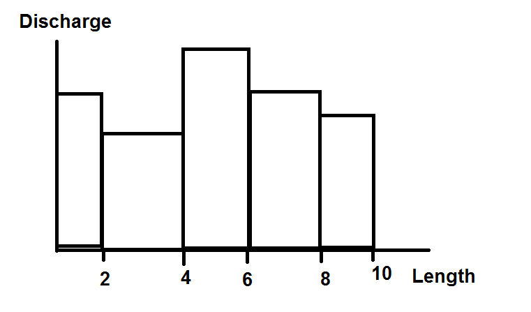
I am working with a featureCollection of river data which is segmented by river reaches (there are hundreds within a few km). This collection includes data of reach length and reach discharge. I am trying to plot a histogram or column chart where the x-axis represents reach length and the y-axis the reach discharge.
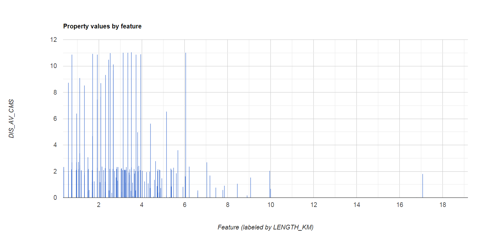
So far I've managed to build a column chart but where length is represented by individual columns rather than grouped by buckets,
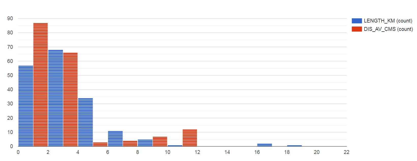
or to build a histogram for reach length and reach discharge separately.
What I would really like is to be able to group hAxis values into buckets for the first chart, but I don't know if it is possible with GEE:
This is the code I've written (studyArea can be any random polygon):
var dataRivers = ee.FeatureCollection("WWF/HydroSHEDS/v1/FreeFlowingRivers");
var dataRiversStudy = dataRivers.filterMetadata('INC', 'equals', 1).filterBounds(studyArea);

print('dataRiversStudy:',dataRiversStudy);

Map.addLayer(dataRiversStudy,{color: "darkblue",width: 2.0},'Rivers');

var chart = ui.Chart.feature.byFeature({features:dataRiversStudy, xProperty:'LENGTH_KM', yProperties:['DIS_AV_CMS']})
                .setChartType('ColumnChart')
                // .setOptions({bucketSize:2,maxBuckets:10}); // This does nothing

print(chart);

var chart2 = ui.Chart.feature.byFeature({features:dataRiversStudy, xProperty:'LENGTH_KM', yProperties:['DIS_AV_CMS']})
                .setChartType('Histogram');

print(chart2);
And here is the link to the code: https://code.earthengine.google.com/4cc589ee05c037494eb20839402096da


