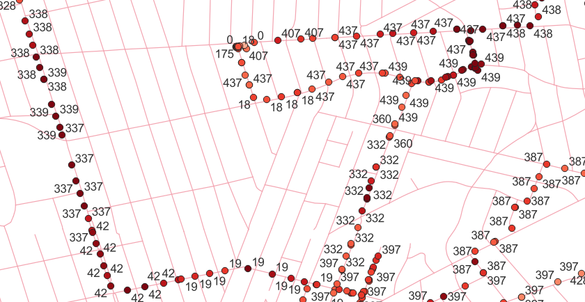
I've got some data that looks like this:

Where the relevant attributes is called pci (and sepearately a signal level). I'd like to create a separate heat map for each pci value (e.g. pci=18).
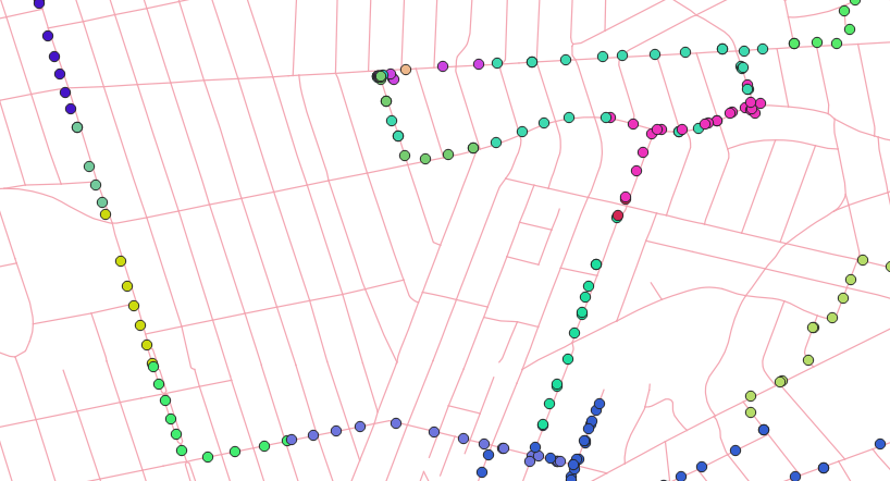
Something sort of like this:
 But with one clear "pci" label per group, and more of a blobby rendering rather than point clusters. And ideally transparent overlap (blobs that touch each other would show a mix of colors).
But there is a trick: it would need a feature like pointcluster has with a radius. The same PCI value are reused elsewhere, so I'm only interested in points within about 500 meters of each other.
Is this something possible to configure QGIS to show? With some code?

