2

I want to create a map that shows in which country which companies (offering the same product) are active. The style of the map should be similar to this one (source): Map of free trade zones, countires in more than one zone are striped So, if company A is red, company B is green and company C is blue, then I want ...
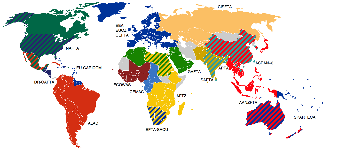
  • a country where only company A is active to be solid red
  • a country where companies A and B are active to be striped red-green
  • a country where companies A, B and C are active to be striped red-green-blue

and so on.

I have not collected the data yet (because before I do that work, I wanted to make sure I can actually make the map) so I have no predefined data structure. I did a PoC that uses boolean attributes, like this:

Country Company A Company B Company C
Germany true false false
France true true false
Netherlands true true true

But I'm open to change it if it makes the creation of the map easier.

Is there an easier way to create this symbology in QGIS than defining each combination (whose number increases exponentially the more companies I include) individually? Or is there another free software that can do this?

2
  • 2
    How do you define whether they are active, do you have an attribute field that says so?
    – Matt
    Commented Apr 19, 2023 at 17:07
  • Yes, You're right. I added this to the original question
    – MariusK
    Commented Apr 19, 2023 at 21:06

1 Answer 1

2

I assume you have 3 attributes: company_a, company_b and company_c, each with values 0 or 1 for active or not.

  1. Create a new attribute no_of_companies by adding the 3 values.

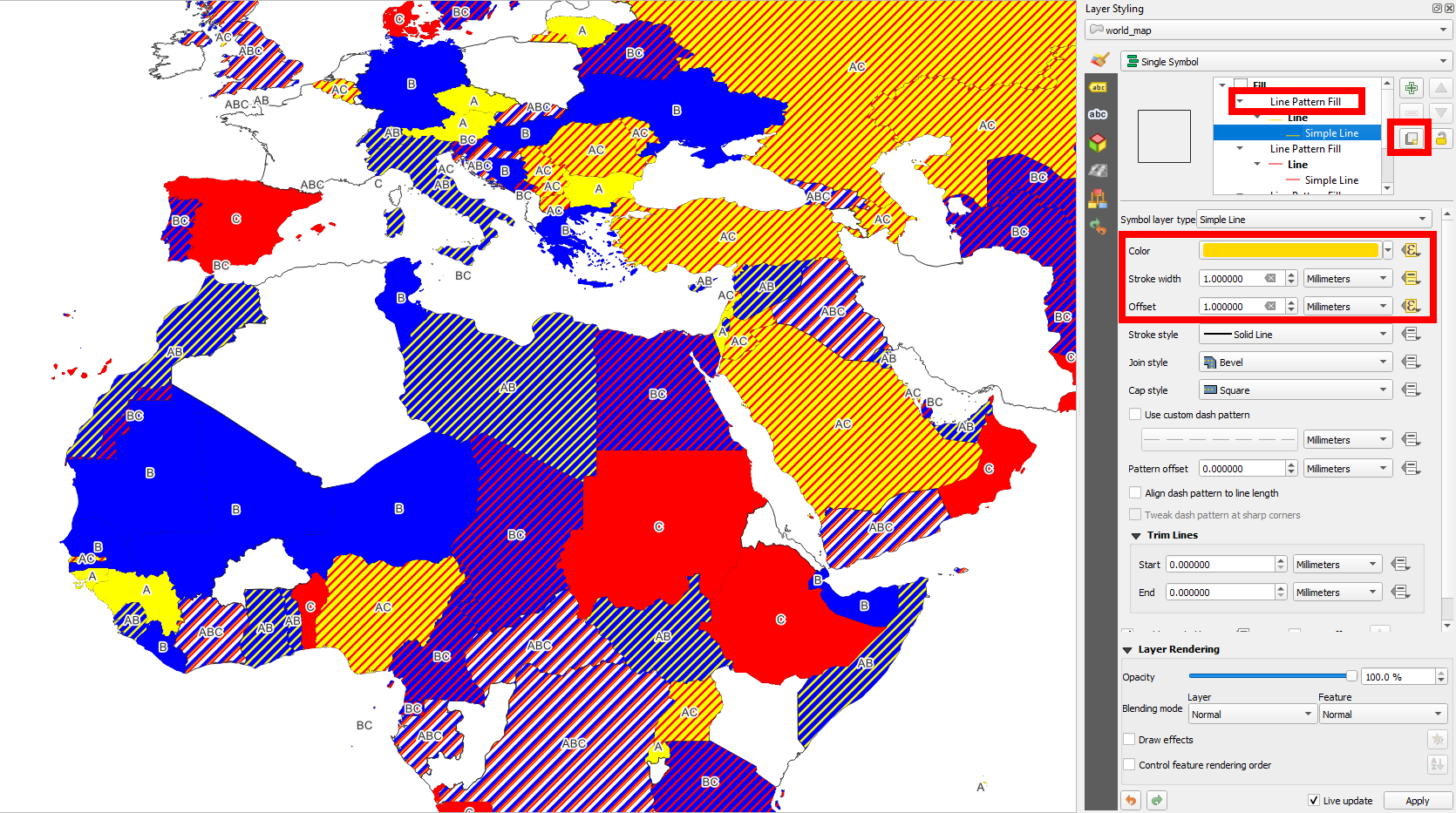
  2. Change the layer's style to line pattern fill. Set spacing to data driven override > Assistant and make settings based on Source no_of_companies with values from 0 to 3 and output again 0 too 3.

  3. For stroke width, again use Assistant > no_of_companies from 0 to 3 with Output size from 2 to 0 (not inverse!)

  4. For color, use data driven override > Edit with an expression like this:

     case 
     when company_c is true then 'red'
     when company_b is true then 'blue'
     when company_a is true then 'yellow'
     end
    
  5. Duplicate the symbol layer and on the symbol layer on the top, set an offset of 1 to the line pattern and change the expression for the color to:

     case 
     when company_b is true then 'blue'
     when company_a is true then 'yellow'
     when company_c is true then 'red'
     end
    
  6. Repeat step 5 with offset of 2 and the expression:

     case 
     when company_a is true then 'yellow'
     when company_b is true then 'blue'
     when company_c is true then 'red'
     end
    

enter image description here

3
  • Thank you, I will try this tomorrow. I used a boolean instead of 0 and 1 (added this to the question now), but that is basically the same
    – MariusK
    Commented Apr 19, 2023 at 21:15
  • Indeed. In fact, I used a boolean value, too.
    – Babel
    Commented Apr 19, 2023 at 21:24
  • Finally had time to try it today. It works, but it is not quite what I wanted: The lines are too thin, so the background is still visible. It want the polygon to be completely covered, like in the example image. Another question: Why is there a "data driven override" icon near at offset in your screenshot? You didn't mention anywhere in your answer that I should use one for this setting
    – MariusK
    Commented Apr 28, 2023 at 9:57

Your Answer

By clicking “Post Your Answer”, you agree to our terms of service and acknowledge you have read our privacy policy.

Not the answer you're looking for? Browse other questions tagged or ask your own question.