8

I have a polygon feature class which has various extent areas with a name which is unique

I also have a table (in a file geodatabase) that has the extent names with a score value. But there can be many score values per extent.

I want to visually represent the score values either by colour symbology or pie/bar chart symbology in ArcGIS Desktop (I have an ArcInfo license too).

It's one of these questions that get bounced round the Esri forums quite a bit, so I was wondering if anyone here had any suggestions or any work arounds that they have done in the past?

5
  • Are the scores categorised somehow (e.g., "cost of living", "school district quality", "home prices", etc)? Or is it just a bag of scores per area?
    – Dan S.
    Commented Feb 23, 2011 at 16:46
  • Also: would it be bad or unimportant if the area of the extent distorted the visual impact of a score?
    – Dan S.
    Commented Feb 23, 2011 at 16:48
  • Are you open to programmatic solutions (e.g. custom renderers), or solely OOTB methods? Commented Feb 23, 2011 at 17:25
  • Open to programmitic solutions - yes
    – Rob Clark
    Commented Feb 24, 2011 at 16:24
  • scores are not catergorised
    – Rob Clark
    Commented Feb 24, 2011 at 16:25

4 Answers 4

3

For a programmatic approach, I see several options:

With any of these approaches, you can use IRelationshipClass.GetObjectsRelatedtoObject, (or RelatedToObjectSet), assuming you've set up a relate to the score table.

1
  • Speaking to Esri at the developer summit, they recommended custom renderer of which the sample is provided here: C:\Program Files\ArcGIS\DeveloperKit10.0\Samples\ArcObjectsNet\MultivariateRenderer Thanks for the pointers Kirk
    – Rob Clark
    Commented Mar 16, 2011 at 16:08
1

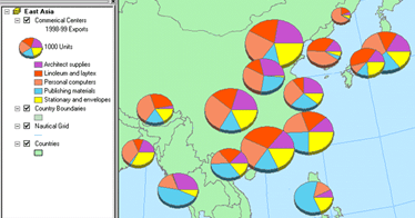
Drawing features to show quantities: Pie Charts and Bar Charts

http://webhelp.esri.com/arcgisdesktop/9.3/index.cfm?TopicName=Drawing_features_to_show_quantities

enter image description here

& About symbolizing data to represent quantity

http://webhelp.esri.com/arcgisdesktop/9.3/index.cfm?TopicName=About_symbolizing_data_to_represent_quantity

If have Business Analyst you can symbolize charts:

http://webhelp.esri.com/arcgisdesktop/9.3/index.cfm?id=1371&pid=1370&topicname=Symbolize_by_Chart_%28Business_Analyst%29

1
  • 1
    Thanks for the reply but already knew this, I'm specifically talking about symbolising data in one-to many relationships. So how to symbolise values bases on a field in the many table.
    – Rob Clark
    Commented Feb 23, 2011 at 16:18
1

I am not sure I understand your question, but I will make my best guess at an answer (since I cannot comment for further information yet).

Assuming what you have is a mass of several scores based on various related table attributes, such as demographic/economic/etc data (median income, population), and assuming you wish to symbolize this data in a manner that relates it together, I would suggest assigning values to certain aggregations of data. For example, if one geographic area has high population but low median income, give it a specific value. That way, when you graph the information (or symbolize it), you can display multiple pieces of data with relatively clean graphical representation. In statistics, this practice is called "recoding," and basically means that you simplify one or more variables into another variable to allow for more accessible representation. If you want help doing something of this nature, I asked a question about an efficient method for recoding values into a new field a couple of days ago.

If this is helpful, let me know and I will expand as best I can.

Recoding values based on contents using ArcGIS Field Calculator?

0

One way I can think of is to do a reverse join (spatial table to business).
Then use a calculated xy to place events.
After that perhaps a label with advanced text> text background and a leader tol set very low.
Then using maplex and setting the distance offset-never remove-best placement options in the placement properties.
Depending on the max # of relates it might at least get all the values on the page.
It would also depend on how important the underlying geometry is. You can set the priority up for items you don't want the labels to overpost.

If your relates have some classification you might start by doing a symbology, and following this answer to get the labels classified, and then use different color balloon callouts.

I sped through the first few steps. If you need more direction leave a comment and I can expand.

Your Answer

By clicking “Post Your Answer”, you agree to our terms of service and acknowledge you have read our privacy policy.

Not the answer you're looking for? Browse other questions tagged or ask your own question.