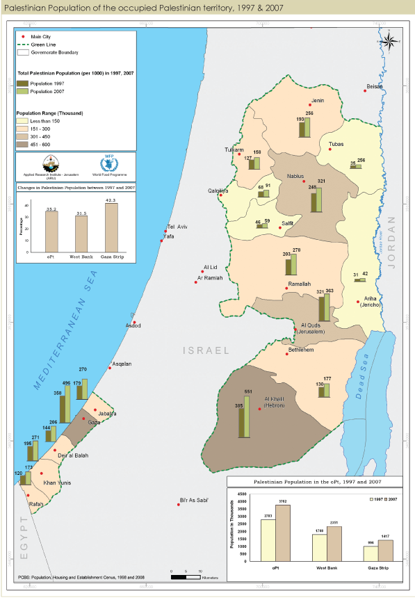
I have a very basic understanding of GIS through some basic work with openlayers in Drupal CMS. I am trying to understand what is the best approach to display a chart on a map (like the one below)? I want the users to be able to at least control/change the numbers of the charts in the map. I understand that the layer itself and the associated legend can be served through a WMS. But what about the statistics that appear above the city. What would be the best "framework" to manage and display such a data?

3 Answers
Another approach is to use something like Google Charts API to generate your symbols on the server side (I think this is possible with GeoServer and SLD) or on the client as image symbols. A colleague did that on a project and worked pretty well with gauge charts. At the end they are just parametrized image urls.
I think one possibility is to use d3.js. Its about visualize statistics as svg graphics. It has some map features too. But more imporatnt is the posiibility to use the d3.js svg layers as overlays in Openlayer maps.
With MapServer you can create dynamic charts layers. This is all server side though, all the user can do is display the layer.
