4

I'm having problems creating a heatmap. I want to show the cumulative increase of points through time manager with heatmap symbology in QGIS 2.18.1 (through layer symbology, not the raster heatmap plugin). The points are meant to display from dark to bright as point density increases. What seems to be happening is as points increase the relative brightness of points where density is low decreases. Ideally I'd like absolute cumulative density to display, not a changing relative density. How do I achieve this?

This behavior is also reflected when I try regular (non time-manager) heatmap. As I pan across the map brightness of areas is increased or decreased depending on the relative density of other areas displayed in the window.

1 Answer 1

2

I'm not seeing the same thing you see with tone changes while panning - only while zooming in/out.

Couple of things you might want to try:

  • set the "maximum" value in the heatmap panel to a constant, which corresponds to the highest density value you expect. You'll need to experiment with this. Set it too low, and the last frame will 'burn out' (go all white). Set it too high, and the last frame will be too dark.

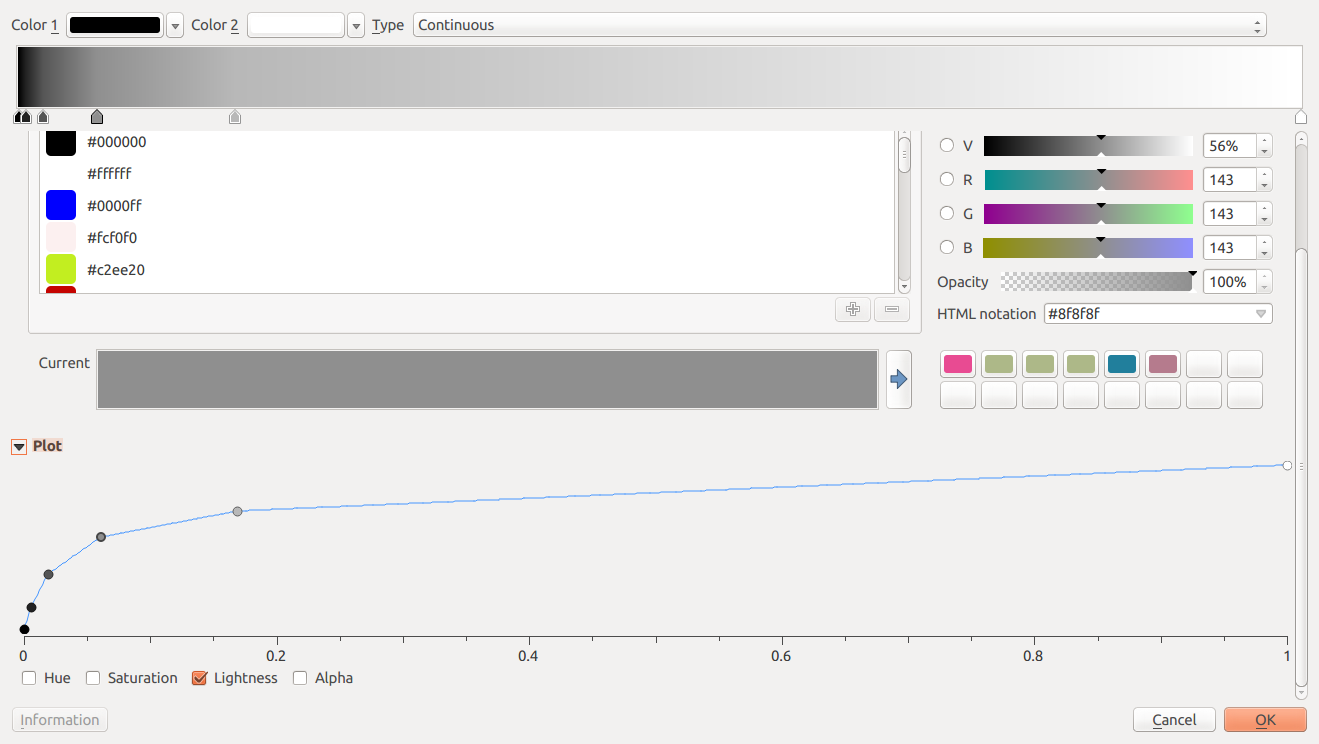
  • you aren't restricted to linear gradients (or to black/white). You could increase contrast in lower density areas by applying a curved gradient like this... you're using 2.18, which includes a nice new "plot editor" for gradients. Select 'Lightness' and edit the curve to look like this...

enter image description here

This is a similar idea to using 'curves' in Photoshop/Gimp to boost contrast in shadows. The steeper the line, the higher the contrast.

Your Answer

By clicking “Post Your Answer”, you agree to our terms of service and acknowledge you have read our privacy policy.

Not the answer you're looking for? Browse other questions tagged or ask your own question.