I'm a newly minted GIS tech.
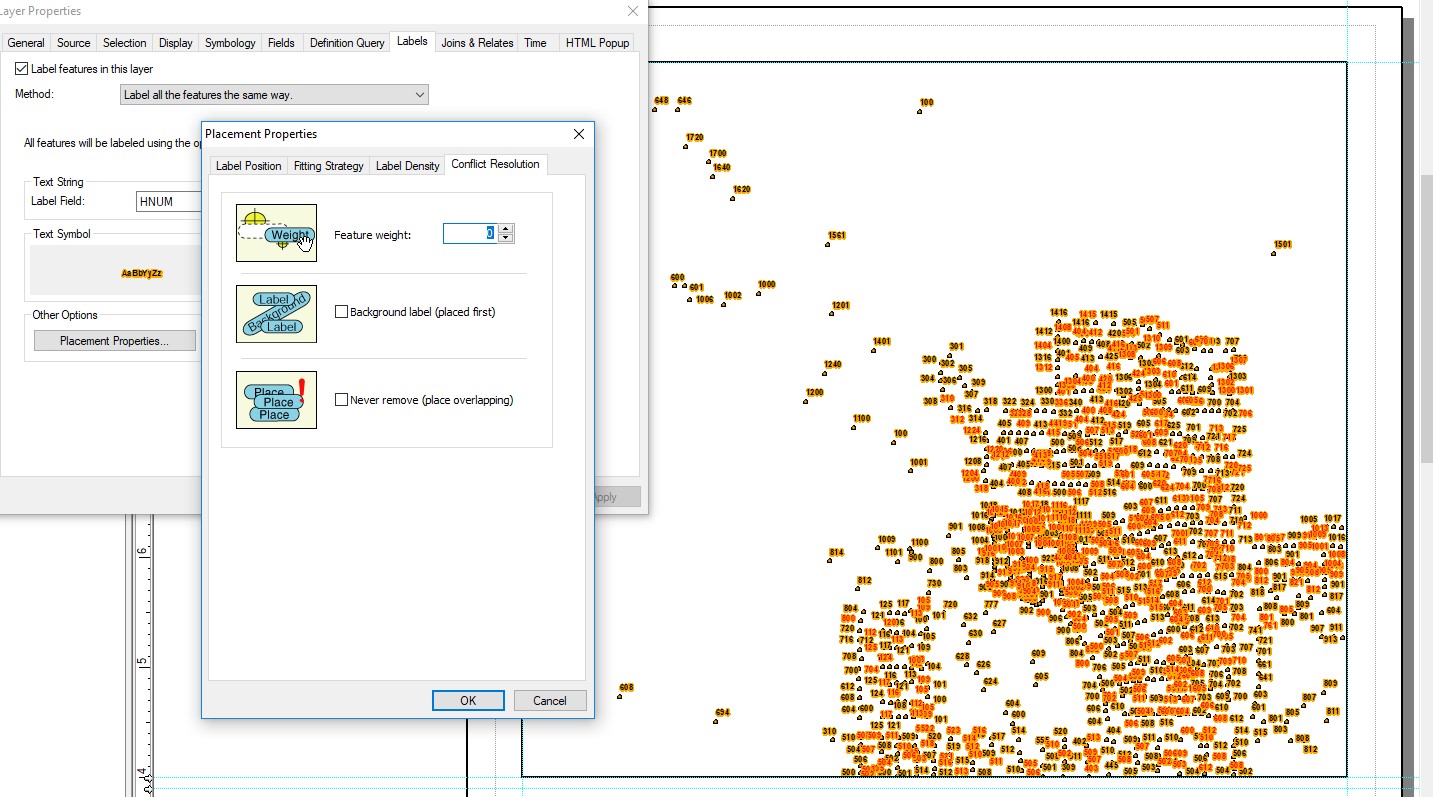
At first, using Maplex, the labels in my point file were displaying in what looked like a clumped, truly random pattern: some areas would have labels stacked on top of each other, while other areas would have no labels at all.
My supervisor thinks this had something to do with how the labels are weighted.
Today, the file is displaying all the labels, but they look like this. Please note I do not have "Never Remove" checked.
How can I label my map legibly?
John W. Fell commented:
From what I can tell it appears that your point cloud is rather dense. You may need to produce maps indexed by grid and at larger scales for each individual map. Data driven pages may be a good solution.
That's actually what we're doing. This page is a 1:12,000 scale map of a square mile, and is page 11 of 38 in the atlas created by the data driven pages.

