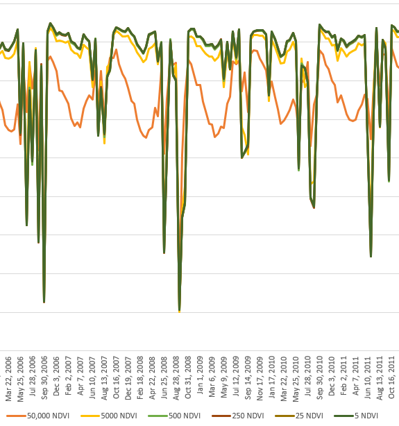
I adapted the script from the guide for ui.Chart.image.series to my region of interest and time period:
// Import the example feature collection and subset the forest feature.
var bm = ee.FeatureCollection("users/fulano_letal/ROI_BM_Mayor100ha_Veg1aria");

// Load MODIS vegetation indices data and subset a time period of images.
var vegIndices = ee.ImageCollection('MODIS/006/MOD13Q1')
                     .filter(ee.Filter.date('2000-01-01', '2017-12-31'))
                     .select(['NDVI', 'EVI']);

// Define the chart and print it to the console.
var chart =
    ui.Chart.image
        .series({
          imageCollection: vegIndices,
          region: bm,
          reducer: ee.Reducer.mean(),
          scale: 50000,
          xProperty: 'system:time_start'
        })
        .setSeriesNames(['EVI', 'NDVI'])
        .setOptions({
          title: 'Average Vegetation Index Value by Date for BM',
          hAxis: {title: 'Date', titleTextStyle: {italic: false, bold: true}},
          vAxis: {
            title: 'Vegetation index (x1e4)',
            titleTextStyle: {italic: false, bold: true}
          },
          lineWidth: 5,
          colors: ['e37d05', '1d6b99'],
          curveType: 'function'
        });
print(chart);
And my question is about the "scale" setting in the ui.Chart.image part, I don't understand what it does and therefore I don't know which value I should use.
I ran a series of comparisons varying the scale with different values (5, 25, 250, 500, 5000, 50000) but still don't understand.
So, can you advise me the "scale" value I should use?

