0

I am trying to create a heatmap of average temperatures the data is basically a CSV file with these items

  1. City
  2. Latitude
  3. Longitude
  4. Temperature

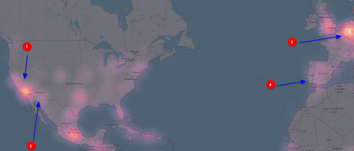
Now when I style the layer as "Heatmap" the result is not what I would expect, as you can see there is something wrong since Los Angeles (1) is much cooler than Phoenix, Arizona (2) yet former comes as very bright in the rendered results. Similarly in Europe you can see Germany (3) and nearby areas are much brighter when compared to Mediterranean regions like Spain (4) enter image description here
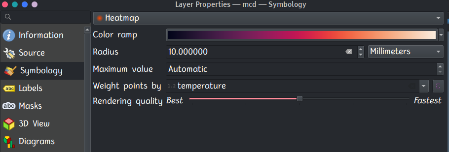
To confirm the setting here is my color ramp enter image description here
Upon inspecting the CSV I realised that some regions are sampled more like for example there are many more cities from Germany than from Spain in the CSV and yet almost all German cities are having lower temperature than those of Spain.

How can I correct this problem? Sorry I don't know the exact term I can use to search for any possible solution for this since I am new to GIS stuff

1
  • 1
    From here you can see what a heatmap is useful for. You kinda said it in your question. It visualize the density of the points (i.e., more points = brighter spots).
    – Nikos
    Commented Apr 18 at 17:00

2 Answers 2

0

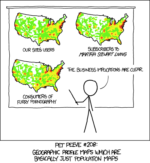
Don't use a simple heat map for this sort of data, as XKCD says:

enter image description here

If you have data that can be normalised by some variable e.g. Childhood cancer incidents, you can divide through by population at risk to get a more meaning full heat map (but there are still better methods e.g. Openshaw's GAM).

For physical measurements such as you have you would be better off using something like Barnes Interpolation to interpolate your points.

0

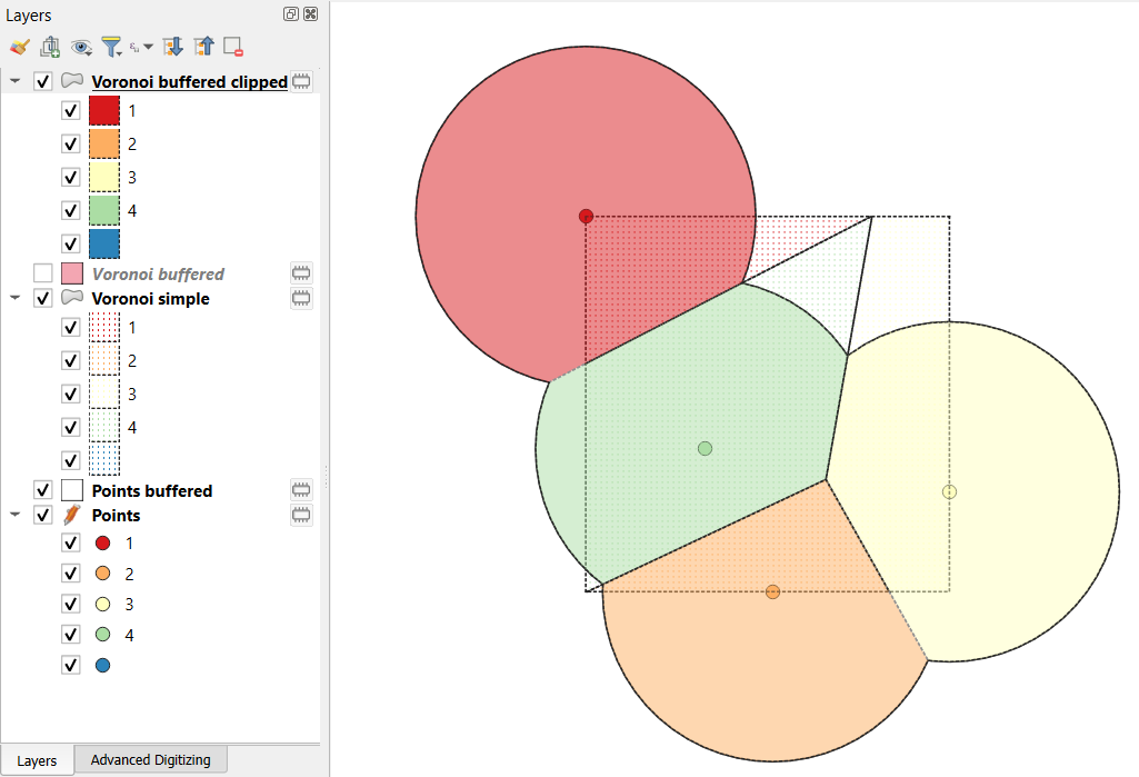
One approach would be to create Voronoi polygons around each point. This takes a point layer, in this case your cities, and tiles your map with polygons so each polygon covers the area that is closer to a specific point (city) than any other. Then you could color each polygon rather than just the city.

Voronoi polygons can be created natively in QGIS using the Voronoi polygons Vector processing algorithm, or in Grass using v.voronoi.

This approach will work nicely if your temperature points are reasonably numerous even in rural areas, just less numerous than in urban ones. It will generate spurious results if you have no points at all in some places, and e.g. the algorithm might colour part of Montana using temperature in Denver or Seattle, depending on the closest point. In addition, by default Voronoi polygons cover the extent of the point layer, so rather than coloring the U.S. you will color a rectangle covering the points.

As a result, you might want to create a mask layer by buffering (dissolved) the points in a certain mile radius that is the largest distance from a city you want coloured at all. Then intersect that with the boundary of the U.S. Then create Voronoi polygons around the points, with a large % buffer parameter to cover that radius. And finally clip the Voronoi output level with that mask layer.

In the illustrative picture attached, the coloured sliced circles represent the final clipped-buffered Voronoi polygons, coloured the same as the points. The dotted polygons show a simple Voronoi, which is limited to the extent of the points, but also would colour remote corners far from any point.

In your case, the buffer size would be chosen to reflect how far away from a point you feel the temperature is representative.

Illustrative Voronoi

Your Answer

By clicking “Post Your Answer”, you agree to our terms of service and acknowledge you have read our privacy policy.

Not the answer you're looking for? Browse other questions tagged or ask your own question.