6

QGIS version 2.18.5

I'm working with annual house prices in England and Wales with excel columns as: A; Transfer Price B; Postcode C; Lat D; Long. There is approx 400,000 rows of data for 2011.

I'm playing around with the colour ramp editor with my points classified by house sale price (transfer price). The highest sale price for 2011 sits at £21,000,000. I've set my gradient colour ramp to 'discrete' with blue up to 99.9% with the remaining 0.1% as red. I've also set the maximum value to 21,000,000.

You would think that would single out the house worth 21mill, but I've attached a screenshot of my heat map below which apparently indicates there were multiple billionaires who sold their mansions last year. Can someone explain why this is happening?

max value at 21,000,000

I also notice when I zoom out, the red areas just get bigger! Why don't they stay the same size? Clearly I don't understand how a heatmap works...

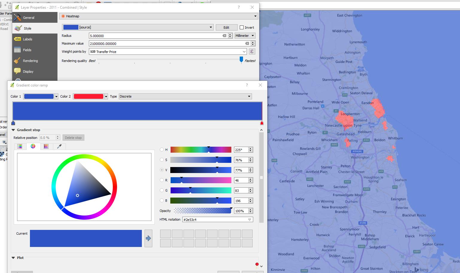
Red areas grow when zooming out

2 Answers 2

5

You are using the Heatmap style renderer, not the plugin. If you want your heatmap to remain the same size, you will need to use the plugin to create a raster file. The heatmap style seems to be affected by the scale of the map canvas which probably explains why the size alters.

This is a good tutorial to follow in creating heatmaps:

http://www.qgistutorials.com/en/docs/creating_heatmaps.html

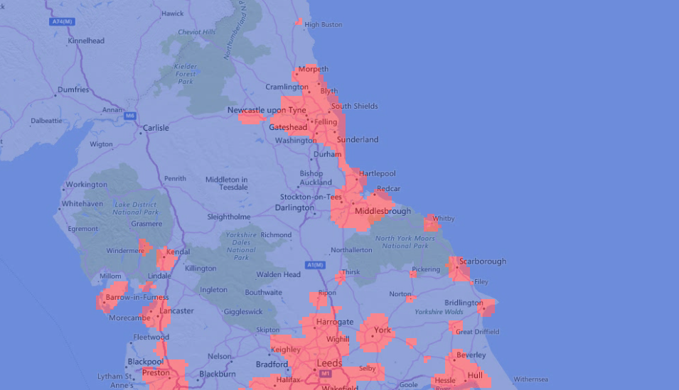
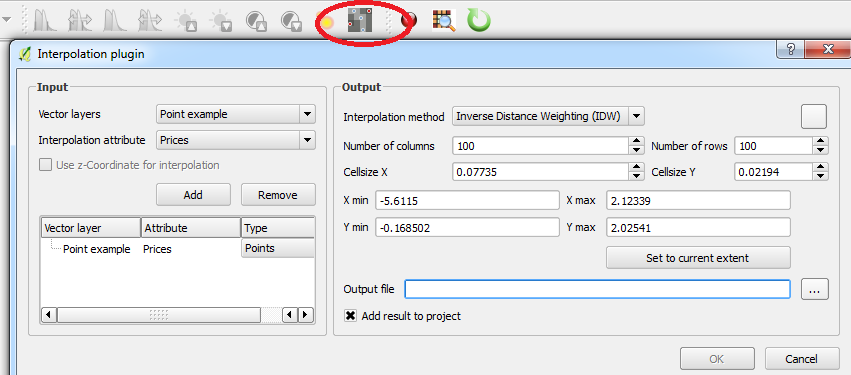
Heatmaps usually focus on the concentration of points and/or attribute values of those points. If you're only interested in houses with the highest sale price then you could consider interpolating the points using Inverse Distance Weighting (IDW) which you can achieve using the Interpolation plugin:

Interpolation

Then with the output, apply your colour ramp to the style. The following post may also be of interest:

How to build effective heat-maps?

1

you have set the radius as being 10 millimeters. It means that all data points laying within 10 mm of each others on the screen, at the current display scale, will be aggregated to set the pixel value. As the display scale changes, the ground distance equivalent to the 10 screen millimeters will change, so if you are at a scale of 1:1, ALMOST only your top point will be displayed in red. As you zoom out, the influence of this top point grows larger (still 10 mm on the display).

Also, let's not forget that nearby data points whose "transfer price" sums to 21,000,000 will be displayed in red. Nearby is also being within 10 mm, on the display, of each others. Zooming out of London, there are probably thousands of transactions whose total is > 21M.

To become independent of the display scale, you would need to change the radius unit from "millimeters" to "map unit" (ideally in meters): ex: points within 1000 meters of each others are aggregated to set the value of 1 pixel.

Your Answer

By clicking “Post Your Answer”, you agree to our terms of service and acknowledge you have read our privacy policy.

Not the answer you're looking for? Browse other questions tagged or ask your own question.