I'm trying to do the following: I have 2 shapefiles, one containing all the public schools in NY, another one containing the hotspots in NY (both in points form).
Now what I'm trying to do is calculate the distance from the schools to their closest hotspot. So that, when I merge it to my "SchoolPoints" layer and import it in TileMill I can visualise for each school the distance from the closest hotspot (for example: coloring the schools close to hotspots green, the ones that are far from a hotspot red).
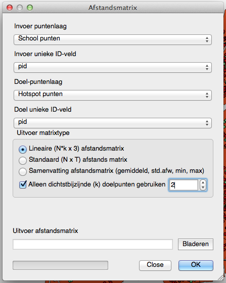
To do this I used the distance matrix tool, with following settings:

(Note: pid is just a unique column I added, containing just integers)
After that I linked the data to the "SchoolPoints" layer (with as mutual field InputID and pid).
That results in a column, with a distance to the closest hotspot for each school, as it should be.
Well, not exactly. The problem I'm facing is: when importing my "SchoolPoints" layer in TileMill and after writing a small piece of code to plot the color differently according to the distance. For example:
[AfstandA7_ < 141.030340279] {marker-fill:#02D722;}
[AfstandA7_ > 1250] {marker-fill:#008A14;}
[AfstandA7_ > 2500] {marker-fill:#D70537;}
[AfstandA7_ > 3750] {marker-fill:#FF1F55;}
[AfstandA7_ >   5096.78247742] {marker-fill:#8A0123;} )
It shows wrong results. Points close to a hotspot that should be green show up red, and points far from hotspots show up green. Some points appear to show a correct color, so the problem is not in my CSS code.
A friend suggested that it might be related to the projection system I'm using. I already used two, both of them giving wrong results:
EPSG:31300    Belge 1972 / Belge Lambert 72
EPSG:2155     American Samoa 1962 / American Samoa Lambert (deprecated)
Now my question is:
What projection system should I use for NY? And also: might that solve my wrong distance values issue?
Here's a link with the shapefiles I used if you'd like to check it out yourself.
