2

I'm under an NDA so I cannot really get into specifics of what I am doing. But, suffice to say, I am taking a large amount of spatially-acquired data and drawing this data onto a Google Map surface using color to represent a range of values.

The main issue we are having is due to the vast amount of data collected, we cannot render this data on a map in a timely manner.

I have proposed that one way to improve performance is to aggregate the data in some fashion, thus reducing the number of data points on the map.

Spatially aggregating the map points are pretty easy, but the data is a whole other matter. We've tossed around simple statistics (min, max, median, mode) as well as some "made up" statistics (you don't want to know).

We were going to start with a simple average, but edge effects are causing some grief as the user zooms in/out of the map.

Generally, we need to maintain trends in a given area as one zooms out on the map. In other words, areas of the map with high correlation will look proportionally similar to other correlated areas at all zoom levels.

EDIT

Imagine a rigid body with up to 64 spatially oriented points where each point has some numeric value. At some interval (typically 200ms), a snapshot of this rigid body takes place and we record each point and map it. This rigid body moves in a predictable manner with some variable speed. It is possible in a given square mile that we have tens of millions of points.

Spatially, correlation only applies if that point "belongs" to the same pass of data. So for instance, if this rigid body moves North for several meters, then makes a u-turn and moves South along side it's previous path, those points that belong to the North path are spatially "different" than those that belong to the South path even if a point on the North path are within inches of a point on the South path. That might be a long-winded explanation for saying we have spatial/temporal correlation.

I can't really describe in great detail what the purpose of the map is due to the NDA. Essentially, the user will look at this map and understand how good or bad things went. They can see this data on a Google map from zoom level 15 and up. Rendering tens of millions of points at zoom level 15 is painfully slow.

What I am looking for is a strategy to keep the same "message" at each zoom level while achieving a good performance.

2
  • Please tell us something about the nature of the data. What is their spatial support (point, line, area)? What is their type (categorical, ordinal, numeric, other)? Exactly how much data do "large" and "vast" mean? What will the purpose of the map be? What do you mean by "correlation" of areas in the map?
    – whuber
    Commented Sep 16, 2011 at 14:25
  • More information is definitely needed. The details of exactly what data you have is not important, but the details of the data are important, such as what has been asked by whuber.
    – MLowry
    Commented Sep 16, 2011 at 15:56

2 Answers 2

4

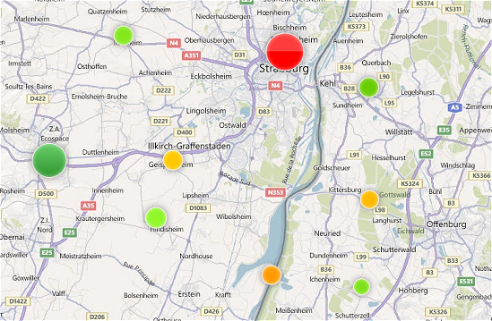
How about dots ? Placed at the position of the aggregation, you can use the average (or one of the stats you described) as radius of the dot (you can even go one step further and make the color match the good/bad status and its saturation match the stength of the radius).

That way, users can see visually where things are right/wrong at a glance.

Example:

enter image description here

Personally I use a variant of this on a map with a few hundred thousands points and instead of a simple dot, it uses a composite of the icons of the main categories of points the cluster contains.


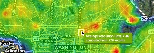
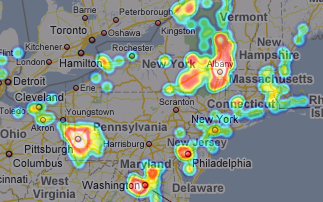
If you only need to visualize, heatmaps would be even better: it's very explicit for users to understand where the hotspots are, examples:

enter image description here enter image description here

Here's a library for Google Maps.

3
  • Heatmaps sounds like something I should persue. Is a simple average good enough to show hot spots as the user zooms out on the map?
    – Tim Reddy
    Commented Sep 17, 2011 at 14:53
  • It should be fine given, as the zoom changes, the resolution gets higher as well (I assume you would draw the heatmap per zoom level [otherwise it could get pixelized if the image get stretched], however I never used that library (we use Bing instead)). As for average being good: it probably is (plus it's the easiest to get started with: if the result looks visually strange, you can always fine-tune it afterwards).
    – wildpeaks
    Commented Sep 17, 2011 at 21:31
  • @wildpeaks I apologize in advance if I have overlooked something. The first example you gave for point aggregations implemented "dots". Do you have link to the code/example/etc?
    – 9monkeys
    Commented Oct 10, 2011 at 18:33
0

Is this the sort of data you can encode into a video?

If so, then Esri's Silverlight SDK has the ability to put this on top of a map as a media element.

Here's an example of an earthquake simulation presented as a video. The number of elements in the earthquake model makes streaming the entire model to the client impractical, so in this situation video makes more sense.

Google, might have similar overlay capabilities.

1
  • Given the technology stack we are using, encoding the data in video form is impossible.
    – Tim Reddy
    Commented Sep 16, 2011 at 17:03

Your Answer

By clicking “Post Your Answer”, you agree to our terms of service and acknowledge you have read our privacy policy.

Not the answer you're looking for? Browse other questions tagged or ask your own question.