62

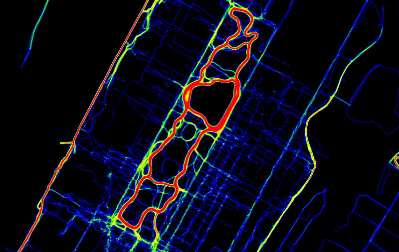
Imagine you're tracking, for example, vehicle or animal movement and receive regular GPS position updates. How would you visualize speed of movement on a static (= printable) map? I've been coloring the points in red-yellow-green where red would be "slow", but I think there has to be a better/more intuitive way to visualize speed measurements.

Another requirement would be that it should be possible to track multiple moving objects at once. Their paths can cross or run alongside each other (on the same roads).

5
  • 1
    What have you resorted to at the end? and on a semi unrelated matter, have you ever worked with Land use transportation models?
    – dassouki
    Commented Jun 2, 2011 at 11:06
  • 1
    @dassouki: I've created some maps using @Mark_Ireland's approach. But it has a tendency of "hiding" the bottle-necks if you plot multiple trajectories on top of each other. I have some other ideas but no definite solution yet.
    – underdark
    Commented Jun 2, 2011 at 11:13
  • 1
    itoworld.com/static/gallery_traffic.html Watch the presentation they did as well. It's not a 100% what you're looking for, but it's a good starting point. On the other hand, what I have done before, is organize traffic by AADT as band widths, and then plotting queues or stoppage as elevation. You know you have an issue when you have a fat and tall band. Fat and not-tall bands indicate lots of traffic but good flow. short and tall bands indicate either issue with traffic signals or not enough lanes to cover the flow
    – dassouki
    Commented Jun 2, 2011 at 11:36
  • @dassouki: I haven't worked with land use transportation models yet. Nice presentation!
    – underdark
    Commented Jun 2, 2011 at 11:45
  • @dassouki, I know it's an old post, but I wonder if you have an updated link for that presentation...
    – Fezter
    Commented Oct 19, 2016 at 3:32

12 Answers 12

35

I played with this topic a lot some time ago. You can find some examples here:

Dobrou extensions plugin examples

Dobrou extensions plugin homepage

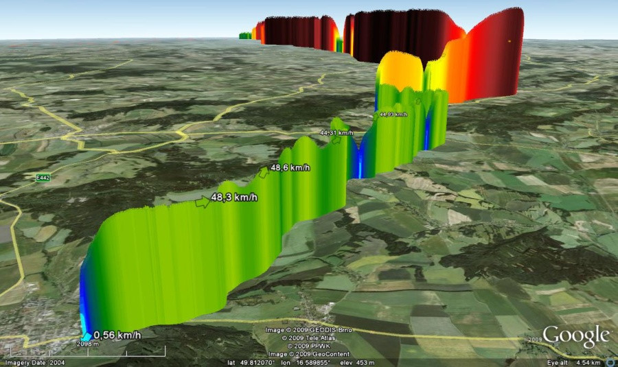
Using Sporttracks and this plugin, gps tracks can be converted to KML and displayed in Google Earth. It supports some ideas mentioned here - track coloring based on color gradient, direction arrows and much more.

Some examples:

3D wall - combination of more things is used here. 1) Arrows showing direction, with actual speed as label. 2) Color of every point choosed from gradient depending on speed. 3) 3D wall - elevation of track "wall" above terrain based on speed.

alt text

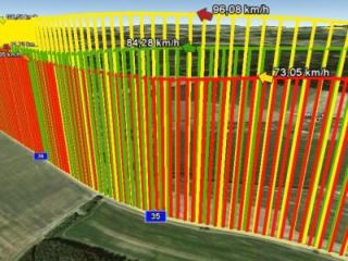
When using only one color for whole track, it's easier to compare speed between more tracks.

alt text

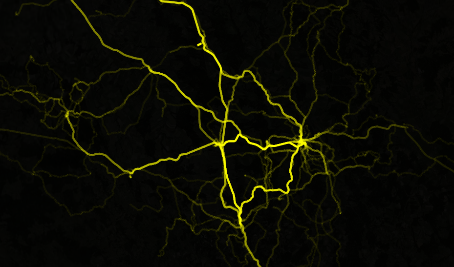
Shadow effect - number of tracks going same way is visualized here, but can be customized to visualize speed, etc.

Shadow effect

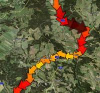
Arrow race - size and color of arrows are based on speed.

alt text

4
  • 4
    I really like the "Arrowrace" option.
    – underdark
    Commented Oct 28, 2010 at 10:21
  • I like alot of it. Do you mind posting some of the kml/kmz files used to make the screen shots?
    – Andy W
    Commented Oct 28, 2010 at 21:31
  • 2
    No problem. Here are some examples in KMZ. (Not exactly files used to make these screenshots, but very similar...) bit.ly/dAYoKc <br> bit.ly/cJl9uI bit.ly/dfAn16 bit.ly/bgQjwr bit.ly/9zgjfC bit.ly/bpdYjs bit.ly/a8i1Hg
    – dobrou
    Commented Oct 30, 2010 at 9:10
  • 1
    I like the shadow effect example, probably because I tend to shy from the overly strong (to my eye) contrasts of the others. Commented Nov 3, 2010 at 2:19
30
+50

I've always done it as width. For example you create a buffer around each point that represents speed and then dissolve the buffers into one. Narrow areas indicate bottlenecks.

For an example see: http://www.fmepedia.com/index.php/Bufferer

Of course, you can even color code the buffers before merging them.

For an example see: http://www.fmepedia.com/index.php/Dissolver

alt text

2
  • 2
    I like the 'belt and braces' approach of using two visual signals to show one variable - in this case color and width. However, I don't think you screen shot does justice to the idea (although, to be fair, I know you're just illustrating the idea) Ideas to improve it; the actual path doesn't stand out enough (to fix, fade everything else and lose the halo), your color palette isn't intuitive (fix with heat map yelow, orange, red instead?)
    – Trevesy
    Commented Oct 22, 2010 at 8:27
  • You're right that the visualization isn't great - but then it was a demo for FME which is more for transforming the data into the right structure for visualizing using a true GIS. The colours? Well green for go and red for stop seemed appropriate! I'm sure I got the idea of using buffer width from an ESRI case study into traffic speeds (City of Portland???). That would probably have much better graphics - though I sadly can't find it now by Googling. Commented Oct 22, 2010 at 19:04
24

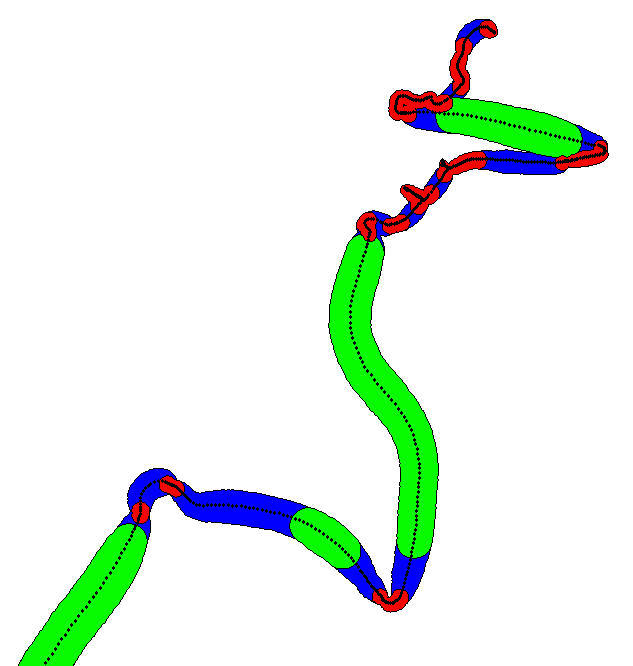
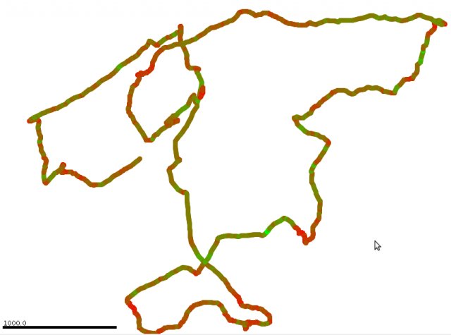
A simple and efficient way is to color the segments depending on their speed. For example, "fast" segments can be displayed in green and "slow" segments in red (other colors can be chosen of course).

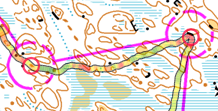
Example on an orienteering-running GPS trace using the software Chmuk:

alt text

Another example with the software quickroute:

alt text

The parts of the route where the movement is fast are well visible, in green, compared to the ones where the movement is slow, in red.

In this example, the color scale is continuous: red is for the minimum speed, and green for the maximum. A finite set of colors can also be used, with different methods to assign a color to each segment according to its speed (like the quantile method for example). Many guys doing orienteering use that to analyse their speed variations during orienteering competitions. It should work for animals and vehicles!

Of course, this method is very simple (maybe 'simplistic') but very easy to implement. The balance between complexity and quality is rather good compared to other tricky representations. Moreover, there is no need to be a specialist to read and understand such map!

6
  • 9
    Kind of pedantic but red and green are the worst colors for color blindness, heat map scale colors (light yellow > orange > red) would be better.
    – Trevesy
    Commented Oct 21, 2010 at 15:36
  • 2
    yes, you are right. This can be parametrised with the softwares. Even better is to use colorbrewer2.org.
    – julien
    Commented Oct 21, 2010 at 16:17
  • 5
    re: color-blindness, see gis.stackexchange.com/questions/2887/colour-blind-cartography Commented Oct 28, 2010 at 22:54
  • 2
    Yeah, agree totally with the green/red colourblind issue - basically looks like a brown line to me...
    – om_henners
    Commented Nov 2, 2010 at 23:22
  • "other colors can be chosen of course". See also the comment just above yours.
    – julien
    Commented Nov 3, 2010 at 10:14
15

I think you may be interested in work described as time geography, and you may want to use search terms such as space-time-path or space-time-cube. In the space-time-cube technique I would imagine you could still use color to represent velocity of the movements, although it is inherently represented in the space/time distance between nodes on your path.

Just doing a google scholar search for time geography visualization looks promising. And one of the first articles to pop up has some good color examples of what I am talking about.

The space-time cube revisited from a geovisualization perspective by: M. J. Kraak Proceedings of the 21st International Cartographic Conference, Vol. 1995 (1988)

Edit: In response that the OP wants to visualize multiple units in space and represent their velocity, space time cubes are probably impracticable. Even if you had some sort of limiting time span in the space time path it would be difficult to get an appropriate viewpoint of the 3d cube without distorting or hiding some of the paths.

I do think julien's suggestion is as good as mine, but it has a similar problem (minus the viewpoint, in the 2d case this will not be a problem). My only other suggestion off-hand would be that you do not have to limit the representation of velocity to dichotomous colors, and since velocity is a continuous distribution I think it makes more sense to use a gradient color scheme. You could also use proportionally sized symbols to represent velocity. Maybe using arrows as the point symbol, and use the direction of the arrow to represent directional components of the space time path would be insightful as well.

When you limit yourself to just a point in space it seems you lose some of the potential visualization of the interaction (paths crossing) between your points. But depending on the topic this may not be of any interest.

1
  • Space-time-cubes look great but I have to track too many moving objects at a time. It would get too messy and unreadable.
    – underdark
    Commented Oct 20, 2010 at 14:33
15

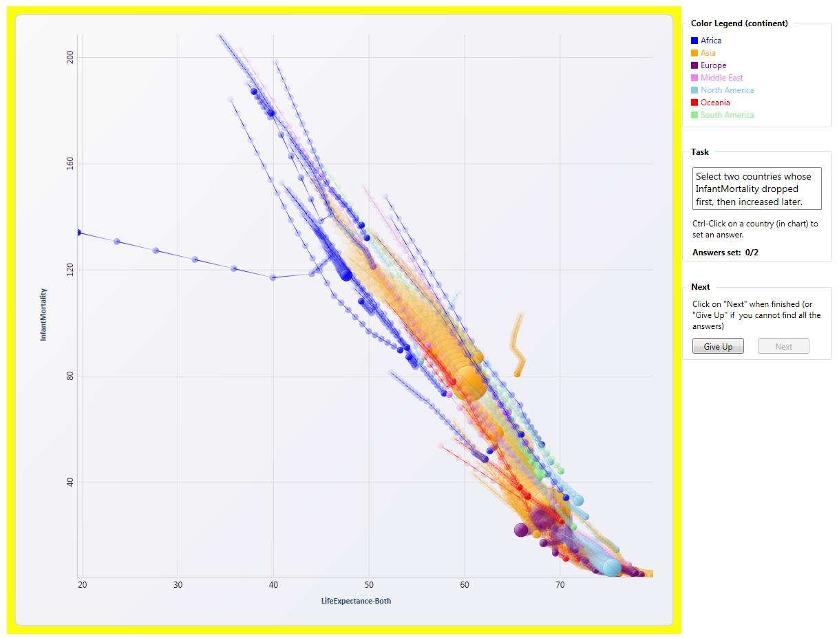
You can record the position of the vehicle with a regular time interval and gradually fade out old time points. Adding a line at each point whose length is representative of the speed can help too. Below is an example from Microsoft Research. It's quite easy to see the relative speed of different countries in this graph.

Trend Visualization

http://research.microsoft.com/en-us/um/redmond/groups/cue/publications/TVCG2008-TrendVis.pdf

5
  • I think you mean line width instead of length. But that is pretty cool and dobrou's lightning bolt uses a similar type of method.
    – Andy W
    Commented Oct 29, 2010 at 13:29
  • That looks really interesting. I feel tempted to try implementing it :) ... This method requires that the time difference between measurements is always the same because speed is only represented implicitly by the distance between consecutive points. That might be problematic with some datasets.
    – underdark
    Commented Oct 29, 2010 at 14:58
  • @Andy W. No, if you look the line lengths are different for the fast blue dots over on the left vsthe orange dots over on the right. I believe the width of the line is based on the the size of the circle.
    – Jay Askren
    Commented Oct 29, 2010 at 16:12
  • I see now. Since the updates are regular intervals the length inherently represents velocity (as underdark pointed out). If all the time points are not regular intervals though that technique would not work. It may be difficult in any real life scenario as data collection would not be perfectly consistent (such as missing time intervals). It's a good idea though, as longer lines will dominate the graphic (which I think the OP wants).
    – Andy W
    Commented Oct 29, 2010 at 16:24
  • @Andy W. That's true. Updates must be in a regular interval.
    – Jay Askren
    Commented Oct 29, 2010 at 17:28
14

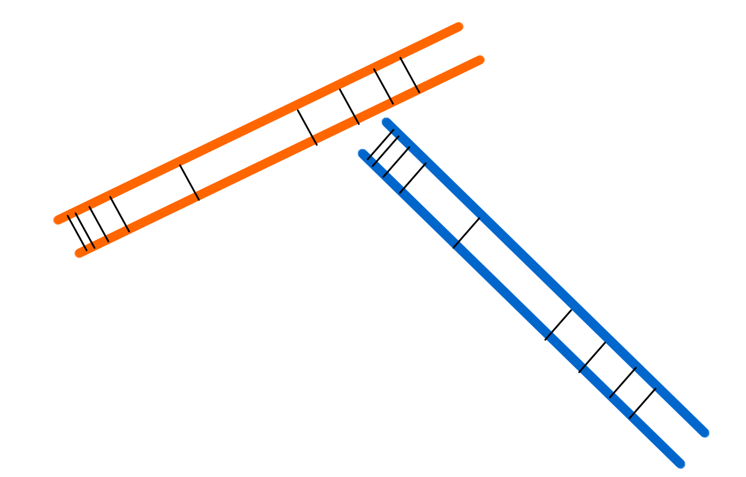
Since you have multiple objects being tracked I would go with using color to differentiate objects and instead of colour to show speed, I'd use thin lines perpendicular to the direction of movement illustrating 10 second intervals (say). Closer lines = slower. Not the best sketch below, but you get the idea: alt text

3
  • That looks interesting! If the thin perpendicular lines would be colored, overlapping tracks would be possible too. Would be interesting to implement for sure. (Or do you know of existing implementations?)
    – underdark
    Commented Oct 21, 2010 at 18:16
  • I agree that color is a good way to represent the different objects. People have an easier time distinguishing between colors than they do mapping a color scheme to numeric values.
    – Andy W
    Commented Oct 21, 2010 at 20:12
  • Underdark - Sorry, don't know of any implementations. Your idea of the 'sleeper' lines (as in railway) being colored is a good one, that would add to the visual difference but the problem would be if you want to use pale colors like yellow then the sleepers would become far less visible.
    – Trevesy
    Commented Oct 22, 2010 at 8:19
12

You might want to have a look at some of Gennady & Natalia Andrienko's papers. They have published extensively on the issue of geovisualization of movement data and some of their output might be helpful here.

Cooper Smith has also done some interesting work using processing.

enter image description here

1
  • 2
    Thanks for the update @radek. Too bad Cooper Smith doesn't describe his approach on the pace example. It seems like he simply plotted all trackers over each other.
    – underdark
    Commented Jun 17, 2011 at 11:25
10

I think I would go for something in the direction of Trevesys suggestion but only with dots instead. Longer between the dots means faster and closer between them means slower.

It is easy to think of the speed like, high speed should get a more powerful visualization, but I am tempted to think the reverse because the symbol is bounded to a special place on earth and a higher speed means a shorter (in time) representation of the vehicle or whatever it is on that spot. Something passing fast gives a smaller footprint than something passing slow.

So an acceleration would then be:

... . . . .  .  .  .   .   .   .   .   .    .    .    .    .     

To me, making the line thicker, feels more like the speed is decreasing, stooping up and time per meter is bigger, longer, fatter.

Another point I think is that a symbol often have to coexist with other symbols. If the symbol is building in thickness or height in third dimension it will have to be the only thing expressed on the map.

Edit: it would be like line symbols representing intervals of speed like

.......   1-20 km/h
. . . .   21-50km/h
.  .  .   51-100 km/h

and so on

Regards Nicklas

2
  • The problem with this is that many real-world tracking systems don't necessarily deliver data in equal time intervals and without gaps.
    – underdark
    Commented Oct 29, 2010 at 21:54
  • 2
    No, I don't mean that each dot should represent one point from the trackingsystem. I mean you have symbols with different density of dots along the line and use the symbols for different speeds. see edit in answer above. Commented Oct 30, 2010 at 5:43
10

You could try using arrow symbols. Length of arrow = speed of the object at that location. You also get direction for free and the whole thing is very intuitive i.e. no need to glance over at the legend to remind yourself of the interpretation.

It's used all the time for wind-speed maps, but there's nothing saying you can't symbolize objects this way too: http://www.cnrfc.noaa.gov/images/storm_summaries/jan1997/misc/300mb_1997.gif

2

[I know I have seen this done before, but I can't find where.]

How about showing the speed as the 3rd dimension of the plot. Instead of just being a flat line, the "height" of the line could represent the speed. This could also be combined with coloring.

1
  • 2
    What you're suggesting would be something like the Space-time-cubes Andy mentioned before. Imho 3D representations get messy really fast (especially with multiple objects being tracked) and they look much poorer in print than on screen.
    – underdark
    Commented Oct 21, 2010 at 18:13
2

Continuing the size/color theme, how about if using points, larger green circles for fast, smaller red circles for slow, with maybe yellow/orange in between?

1
  • That would look a lot like Mark's suggestion (gis.stackexchange.com/questions/2722/…). It's simpler to do, but there might be trouble distinguishing between different moving objects when their paths overlap.
    – underdark
    Commented Oct 28, 2010 at 14:11
2

I generally agree with all the flow map/change in color strategies listed, but this question is old and I was trying to think of alternative strategies.

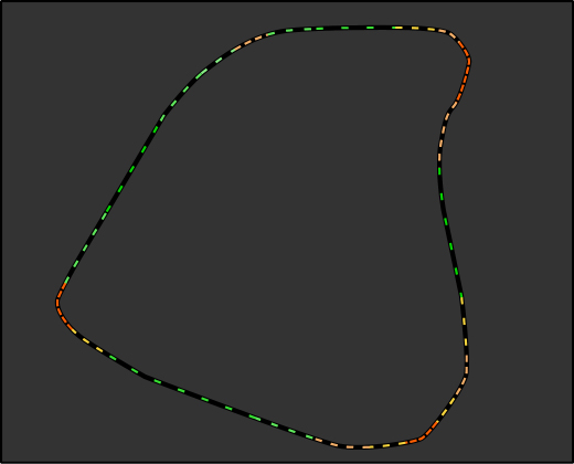
I was thinking that if you are tracking GPS at some timed interval, a path's speed would look like flow density (ie, going slow - recorded observations would be dense, going fast - the recorded observations would spread out). So you could symbolize the speed of line segments with dash gap widths.

enter image description here

Then I supplement the path with color to reinforce this... The requirement to chart additional paths would just include parallel paths, or separate colors for each path.

Your Answer

By clicking “Post Your Answer”, you agree to our terms of service and acknowledge you have read our privacy policy.

Not the answer you're looking for? Browse other questions tagged or ask your own question.