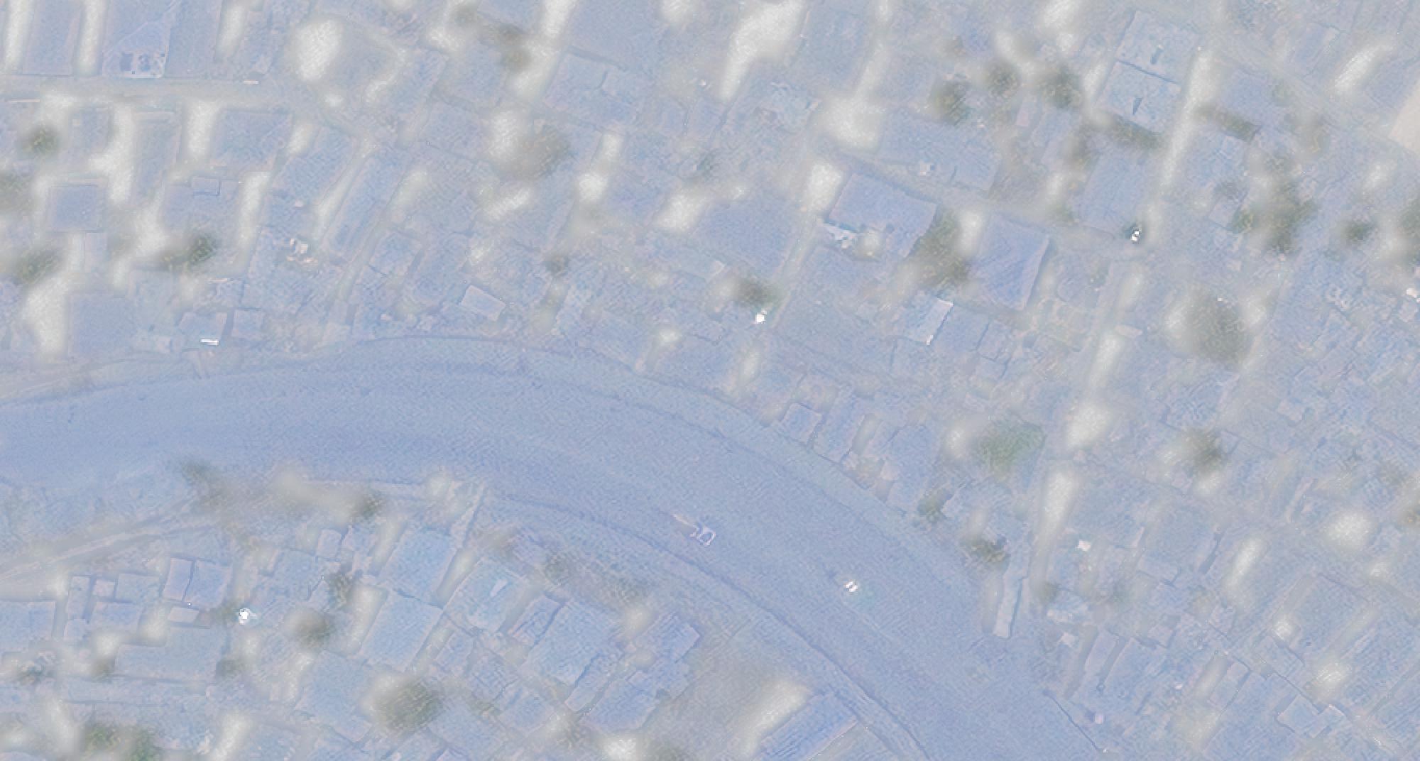
I have received the following satellite image. Unfortunately, the color grading is really poor and makes working with this image very tedious (see screenshot below). I am rather new to QGIS. How can I make this image more intuitive to read?
1 Answer
I suspect this kind of colour re-balancing might be best done in an image manipulation package such as Photoshop or the open-source GIMP.
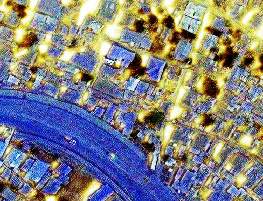
A minute or two's tweaking with GIMP gives me this monstrosity:
so I'm pretty sure careful tweaking of the colour level curves might give you something you find acceptable. Although there's not much else but blue in there.
You'll need to make sure any georeferencing information is kept - this is probably easiest by creating a "world" file (which identifies the corner points in the raster coordinate system) and making sure you don't crop the image while processing. Then it should go back into the same place.


