16

I have already seen maps using deformation to visualize information. For example, this map shows temporal distance between some French cities when traveling by train: http://www.nf-ameublement-pro.com/sc/images/new/newsletter/septembre/carte_france.jpg

Is there a name for this kind of map? Also, is this type of map available in any GIS software?

2
  • The effect of the TGV (especially Paris-Dijon-Lyon) is particularly pronounced in this illustration.
    – whuber
    Commented Nov 8, 2011 at 18:22
  • Trimaps (trimaps.com) enables to use that kind of maps in application and geolocalize on it. Note that you have to come with the map...
    – Gilbou
    Commented Nov 14, 2014 at 15:26

5 Answers 5

15

This is called a distance cartogram. Some add-ons for ArcGIS have been produced to create area cartograms. Mark Newman provides free GIS-independent software to implement his area cartogram method. Methods of creating distance cartograms are known in statistics as multidimensional scaling (MDS). I do not know of any GIS software that implements MDS, but it's available in full-featured statistical packages like Stata (commercial) and R (free).

12

Anamorphic map or even cartographic anamorphosis are also used.

Scapetoad does it.

0
7

Scapetoad produces area cartograms, not distance cartograms. You can produce distance cartograms with Darcy You can download the software (Java program) : https://sourceforge.net/projects/jdarcy/

Before using Darcy you have to transform the distance matrix in coordinates (multi dimensional scaling). In R the simple function for MDS is cmdscale. Now, Darcy implements this R function.

6

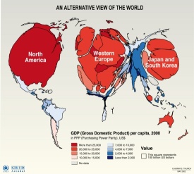
There is another type which is called "Cartogram"
QGIS has a plugin to generate cartograms.
This one shows the size of the country based on GDP:
Cartogram of "GDP per capita" by country, 2000

1
  • 1
    The original map is at maps.grida.no/go/graphic/world_economy_cartogram (Philippe Rekacewicz, UNEP/GRID-Arendal, Vladimir S. Tikunov). @Pablo appears to be correct but the legend title is wrong (and so is the description on the Web site): apparently, the map areas are proportional to GDP and the colors denote GDP per capita.
    – whuber
    Commented Mar 17, 2011 at 19:35
0

I've found the DistanceCartogram plugin (https://plugins.qgis.org/plugins/author/Matthieu%2520Viry/) for QGIS. But it keeps getting lots of errors when I try to use it.

Your Answer

By clicking “Post Your Answer”, you agree to our terms of service and acknowledge you have read our privacy policy.

Not the answer you're looking for? Browse other questions tagged or ask your own question.