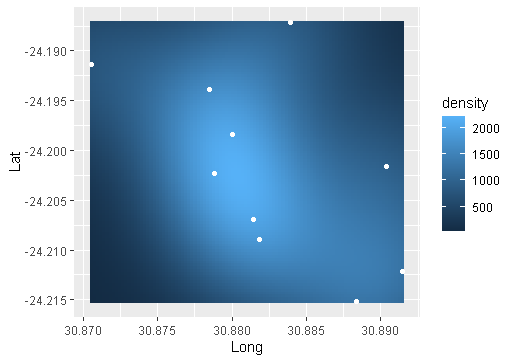
I'm working with a two-column data.frame with the columns containing x and y coordinates (Longitude, Latitude). A simple way to visualize a density map is by using the 'stat_density_2d' function. When I run the code below on my data, I obtain large density values. To me, this density plot suggest that the densities are larger than the total number of observations, which does not make sense to me. I have provided a small subset of my data.
df <- structure(list(Lat = c(-24.1871741, -24.2069615, -24.2022726,
    -24.2016188, -24.2152107, -24.1939073, -24.1913561, -24.198409,
    -24.2088875, -24.2121186), Long = c(30.8839167, 30.8814249, 30.8788437,
    30.8903969, 30.8883906, 30.8784664, 30.870561, 30.8800543, 30.8818679,
    30.8914805)), row.names = c(NA, 10L), class = "data.frame")

ggplot(df, aes(Long, Lat)) +
    stat_density2d(geom="tile", aes(fill = ..density..), contour = FALSE) +
    geom_point(colour = "white")
Even with only ten data points, the plot suggests a density range between 500 and 2000 points. I don't believe the output is wrong, but I'm just wondering if some could explain to me why these values are so larger on such a small dataset. How should I interpreted the density values from the legend?


ggplot2::stat_density2dis callingMASS::kde2dfor the density estimate andMASS:bandwidth.nrdas the automatic bandwidth plugin. I cannot imagine that the automatic bandwidth selector is coming up with anything relevant using lat/long coordinates. Geographic coordinates are degrees not distance.