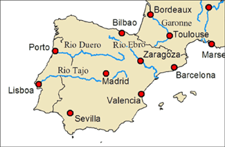
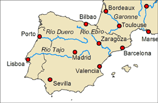
Water is best in a serif type-face (font) and italic. Blue is good, but don't be a slave to that. Use splines where possible to follow the feature curvature. S p a c e d characters and words reinforce the suggestion of flow, and can tie a long sinuous water course together. Except when it means turning the map or one's head upside down to read, have the words run in the direction of flow.
Roads, trails, infrastructure are good in a sans-serif type-face, often black. Letters can be closer together (than water) and a little bit of squarish regularity is Ok; we're talking about manufactured features after all.
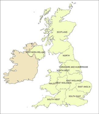
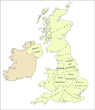
All things: keep inside the feature where you can. For points, pick an off-set location (e.g. top right) and stick with it as best possible. Use leader arrows very sparingly. Use bold/heavy text for big, important things, light, thin text for stuff that should be there, but in the background.
This isn't text, but important for text: have a unifying neutral background colour or hue to hold everything together. A bright white background makes everything pop and jump and squiggle.
Good labels are the single most labour intensive part of any map composition, and arguably a map's most important feature. What's the point of having a thing in a map if people can't find out what it is? Whatever you do, don't leave them to then end, as an after thought. Automatic label placement, having the software do the work for you, is a starting point, not the end.
Read anything by Edward Tufte and Eduard Imhof and What Makes a Map Beautiful?
caveat: All rules are made to be broken (but knowing when to break them can be dastardly difficult).


