2

I have a list of values for some data recorded via Magnetic susceptibility, I have these in a shapefile and want to try creating a colour map out of the values.

The values that I'm using relate to, OSGB 1936 / British National Grid, EPSG:27700

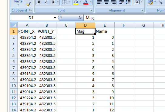
Example of the data in CSV file:

example of the data in csv. file

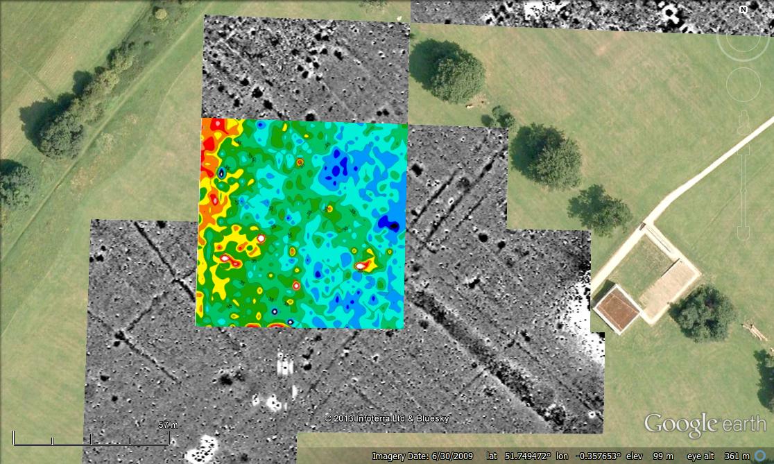
I want to try to achieve something similar to the coloured area in the second image. I don't know if this will be possible in QGIS but I thought it was worth trying.

example of mag sus data

1 Answer 1

3

QGis should be able to import this directly as an XYZ grid (under Raster) provided it meets the following (from the GDAL Manual):

  • Those datasets are ASCII files with (at least) 3 columns, each line containing the X and Y coordinates of the center of the cell and the value of the cell.

  • The spacing between each cell must be constant and no missing value is supported. Cells with same Y coordinates must be placed on consecutive lines. For a same Y coordinate value, the lines in the dataset must be organized by increasing X values. The value of the Y coordinate can increase or decrease however. The supported column separators are space, comma, semicolon and tabulations.

The manual also suggests that you name the columns X, Y & Z for best detection but it might work as you currently have it.

Once imported it will need to be coloured in as with any other raster -> properties->Style.

Your Answer

By clicking “Post Your Answer”, you agree to our terms of service and acknowledge you have read our privacy policy.

Not the answer you're looking for? Browse other questions tagged or ask your own question.