I am looking for a way to test a hypothesis;
"the closer my point feature is to my line feature (both vector), the higher the score of C will be"
(for other sections of my research so far I have looked at overall density of my points using heatmap, and at the distance from line features using the distance matrix)
for this stage so far i have created a weighted heatmap based on the score of C in my database, but i don't know how to relate this to my line data
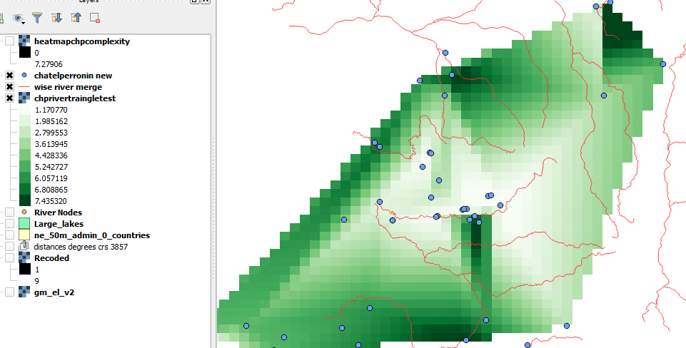
my desktop currently looks like this:

a look at other questions seems to suggest using interpolation but i'm not entirely sure how this works, i used the method to produce the image in the picture above but i dont know how to interpret it
so any ideas how to present weighted attribute data and relate it to my line data? if interpolation is the answer, links to description of interpolation in laymans terms are requested. am using qgis 2.10
