6

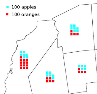
How would the type of map symbology illustrated here be typically described?
enter image description here

Specifically where symbology is used to represent arbitrary quantities of phenomena, and these being charted together for a particular zone. I'm looking for good examples of this type of approach (to compare favourably to the seeming preference these days that many people have for embedding pie charts inside polygons), but am not sure if there is a standardised term. Can anyone clarify?

I seem to remember a pretty good example of this approach focussed on the US western coast, but I forget the author and specific context..

3
  • 1
    I would call them glyphs, but I'm not sure if that is a standardized terminology. See citeulike.org/user/apwheele/article/12238640, and citeulike.org/user/apwheele/article/11627768 for examples. A variety of examples can be found in MacEachren's How Maps Work, and some notable ones are from the work of Dan Carr and William Cleveland (and pie charts from Minard!) It is similar to the ISOTYPE like graphing symbols as well.
    – Andy W
    Commented Sep 28, 2013 at 15:43
  • 1
    These symbols are used to represent arbitrary quantities, not just "discrete numbers of phenomena." Like most symbols used in cartography, they have been binned into discrete classes, but that does not change the nature of the variable being represented.
    – whuber
    Commented Sep 29, 2013 at 19:00
  • I agree 'arbitrary' is probably clearer than 'discrete'
    – geotheory
    Commented Sep 30, 2013 at 10:13

2 Answers 2

6

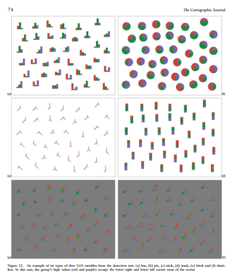
I would call them glyphs although I'm skeptical it is such an established adjective that it will be immediate to many audiences. Vasan et al. (2013) is a great review of different types of glyphs used in the literature (plus an experimental study for the differences between bricks like you show and clustered bars, pies, and sticks). The image below is from the cited paper and shows the different experimental stimulus:

enter image description here

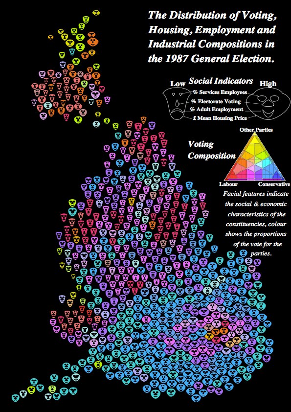
Other ones I am familiar with are Chernoff faces and population pyramids (Dorling, 2012), filled rectangles to replace univariate choropleth maps (Cleveland & McGill 1984), star plots (Friendly, 2007; Wickham et al. 2012) and more complicated stick glyph variants (Maddox et al. 2013). Below is an example of Chernoff faces taken from Dorling (2012) (of course positioned according to a circular Dorling cartogram - I'm reading the Dorling book now and it has a ton of different types of glyphs I haven't seen elsewhere).

Dorling Chernoff Faces
(source: dannydorling.org)

Some notes on their use:

  • Irregularly spaced data are typically more difficult to visualize and have problems of glyphs overlapping and being occluded (Wickham et al. 2012).
  • Glyphs tend to generate extremely complicated maps. Because of this, it is often more effective use of space to make several small multiple maps as oppossed to one map will all of the information superimposed. See Effectively displaying demographic data on a printed map for related discussion.

References

10
  • +1 A practical comparative analysis of glyphs (on a regular grid) appears among the answers at mathematica.stackexchange.com/questions/23895. They demonstrate that glyphs do not necessarily generate complicated maps: indeed, their salient property is due to the capacity of our native visual processing system instantly and easily to identify spatial patterns within a huge collection of (simple) glyphs. For this to work well, each glyph must be stripped of all non-informational elements: the illustration in the present question is a good example.
    – whuber
    Commented Sep 29, 2013 at 19:14
  • Useful stuff Andy thanks (and to @farhat-abbas). I appreciate the value of a tried and tested bar chart (74.a) for conveying absolute and relative data. Here however I'm specifically interested in the use of charted symbols to represent unit quantities of phenomena.
    – geotheory
    Commented Sep 30, 2013 at 10:08
  • @whuber vector flow maps are great examples. Dorling has another that is one of the nicest examples of social science data I have seen here (although IMO he could make the arrow heads smaller). The arrows point to changes in the ternary diagram of election results in Britain's three party system. Social science data are rarely so kind, and they are much more difficult to parse when the arrows aren't laid on on a regular grid and the surface isn't as smooth.
    – Andy W
    Commented Sep 30, 2013 at 12:20
  • 1
    @geotheory - you asked what the terminology would typically be described and I answered glyphs. I then gave a variety of different examples of glyphs, a bunch of citations and some general discussion of when they are most useful. What other information are you looking for exactly?
    – Andy W
    Commented Sep 30, 2013 at 12:30
  • 2
    I've seen that particular statistical graphic called a waffle chart - and the point is loosely based on the ISOTYPE like diagrams of counting objects. Such glyphs are not regular enough to likely have any type of standardized terminology I imagine though.
    – Andy W
    Commented Sep 30, 2013 at 12:33
1

Not sure but checkout http://dataveyes.com/blog/rennes/index-en.html it may help you to build similar visualization.

http://www.inquiron.com

Your Answer

By clicking “Post Your Answer”, you agree to our terms of service and acknowledge you have read our privacy policy.

Not the answer you're looking for? Browse other questions tagged or ask your own question.